


Another rare nugget of French motion design from the seventies. This entertaining title sequence by Tito Topin and Jed Falby for Les Gaspards (English title: The Down-in-the-Hole Gang) serves as a social-political commentary on the gigantic urban development projects in Paris, which transformed parts of the Parisian capital into a big contruction sites for several decades.
Les Gaspards takes place in the early 1970’s when the “Trou des Halles” – a giant hole in the middle of the city – amputated Paris from its historical commercial center. The construction would take almost ten years and was intended to create a hub for the Subway, the RER (the urban train) and eleven underground roads, on top of which a huge shopping mall was erected.
.jpg "Les Gaspards (still)")
In France, these ongoing constructions became the subject of an animated political debate between the modern and the old way of thinking, showing a diametrically opposite vision of the future for the French capital. A funny anecdote is that Les Halles had already been used, in 1973, as a backdrop for the adventures of Buffalo Bill, General Custer and the Indians in Marco Ferreri’s film Touche pas à La Femme Blanche, aka Don’t Touch the White Woman!, featuring Marcello Mastroianni and Philippe Noiret and produced by Jean Yanne.
In French, Gaspard is a slang term for a rat. And rats inhabit the Parisian underground in huge numbers. Driven out by urbanization, “the rats,” or the market traders have to leave their usual spots at Les Halles for the new markets located in Rungis, forty kilometers further south. In this second comedy directed by Pierre Tchernia, Philippe Noiret plays the chief of the rebels, Les Gaspards. He is a descendant of a Parisian noble family who fights in the underground and the sewers against the Minister of Urbanization whose sole aim is to equip the capital with tools worthy of his megalomaniac ambitions.
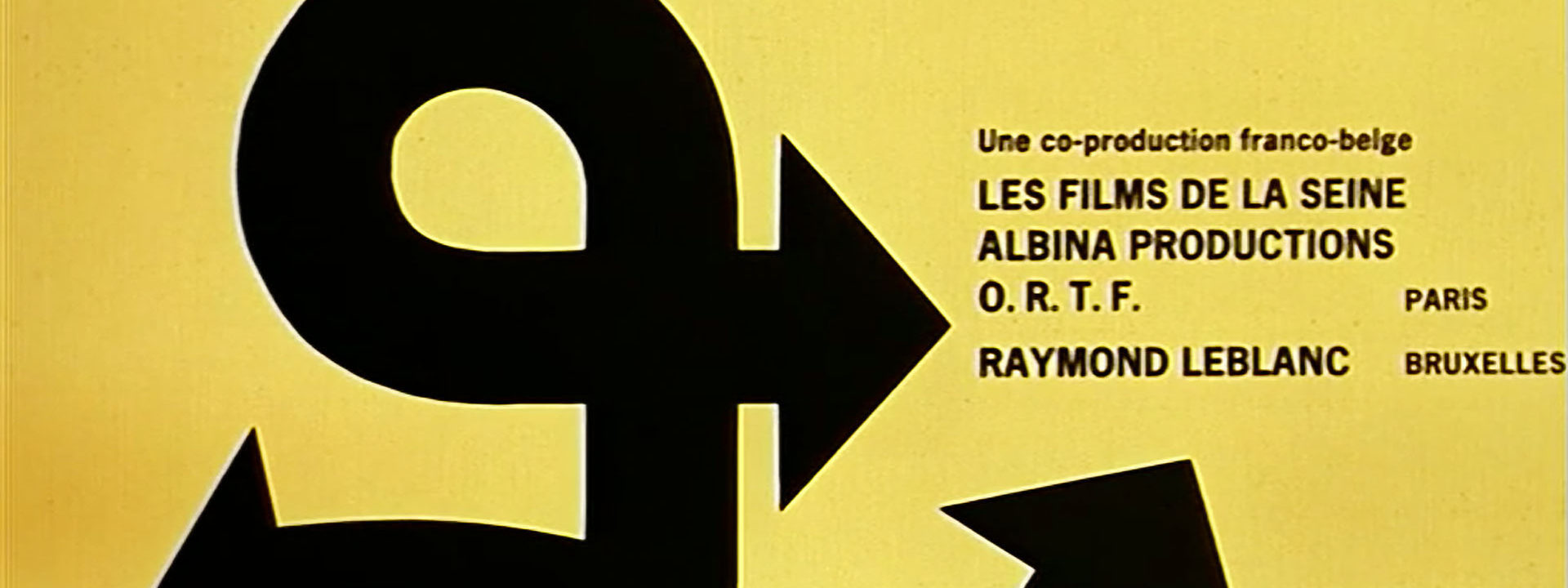
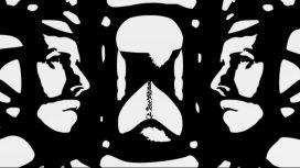
Starting with a simple graphic idea, Tito Topin and Jed Falby created a very effective title sequence. Throughout a visit of the city, the camera focuses on road-signs while showing in the background hazy images of the ongoing transformation of the town. The black silhouettes of the road-signs become animated, disclosing strange events that mark the beginning of this charming film.
")
The main typeface used in the title sequence is Charrette – a stencil font inspired by the lettering on the drawing of the Swiss architect Le Corbusier. These upper case letters are really only good for making stencil key sets and to mark the building site’s fences. Gerard Calvi’s smooth and subtle music is perfectly tuned to the general tone of these credits, bringing in a particular flavor to this entertaining comedy.
Text: Hervé Tissot, © SubmarineChannel 2011
Year of production
1974
About Tito Topin
Born on February 23rd, 1932 in Casablanca (Morocco), Tito Topin is a graphic designer, scriptwriter and author. He started as a designer in advertising in Brazil (1956-1962) before becoming the artistic director for Havas-Maroc (1962-1966). He then moved to Paris where he worked as an illustrator, a graphic designer, poster artist, script writer, novelist and cartoonist. Topin also wrote some remarkable scripts for short animated movies, one with Claire Brétécher, a most celebrated French cartoonist. He stopped his promising career in the cartoon industry to become the scriptwriter of Navarro, one of the most popular French TV series. He also turned into an acclaimed author of detective novels in addition to taking up a teaching career in scriptwriting at a movie school.
Full credits
Title Designer
Tito Topin and Jed Falby
Music
Gerard Calvi
Movie director
Pierre Tchernia
Molt divertits i originals