

Sometimes it’s better to team up than to compete. Two upcoming French motion designers-directors Jean-Baptiste Lefournier and Camille Bovier Lapierre joined forces to compete in a pitch for the title sequence for one France’s biggest blockbuster movies of the year, Astérix and Obélix: Au service de Sa Majesté. Lefournier shares his process, including the Monty Python-esque early concept.
A Watch the Titles premiere…
.jpg "Asterix and Obelix: God Save Britannia (stills)")
Astérix and Obélix are two of the most popular French comic book characters ever created. To give you an idea, 350 million copies worldwide have been sold of the French comic book series The Adventures of Asterix. Much more than Tintin. Starring Gérard Depardieu as Obélix, God Save Britannia is the fourth movie in the comic frenchize.
Astérix the comic series is big all across Europe, but Lefournier confesses that he’s never been a big fan. “At a very early age, I used to sneak into my father’s library to read Jean-Giraud’s Moebius comics which were totally inappropriate and thus very captivating. However Camille is a great reader of Astérix & Obélix.”
MERGE AND CONQUER
The VFX Producer of Mac Guff Ligne in Paris, the studio in charge of most of the visual effects on the movie, Rodolphe Chabrier invited three designers to pitch on the title sequence. Camille Bovier Lapierre was one of them, recounts Lefournier. “Camille and I were suposed to pitch against each other, but as we had a friendly relationship we chose to work as a team.” It was a winning move.
")
")
Astérix and Obélix: God Save Britannia, early concept (stills)
What made you win the competition?
“The initial concept was some kind of Monty Python-esque animated sequence based on the idea of a culture clash – the French versus The British,” says Lefournier, “The director, Laurent Tirard loved it very much and I think it made us win the pitch.”
EARLY CONCEPT
Ironically, as the editing of the movie went on, both producers and director realized this concept was giving away far too much information on the cast and characters. So it was back to the drawing board, literally.
“Starting off from scratch the director told us that he wanted to focus on the Union Jack.”
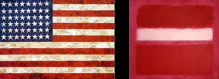
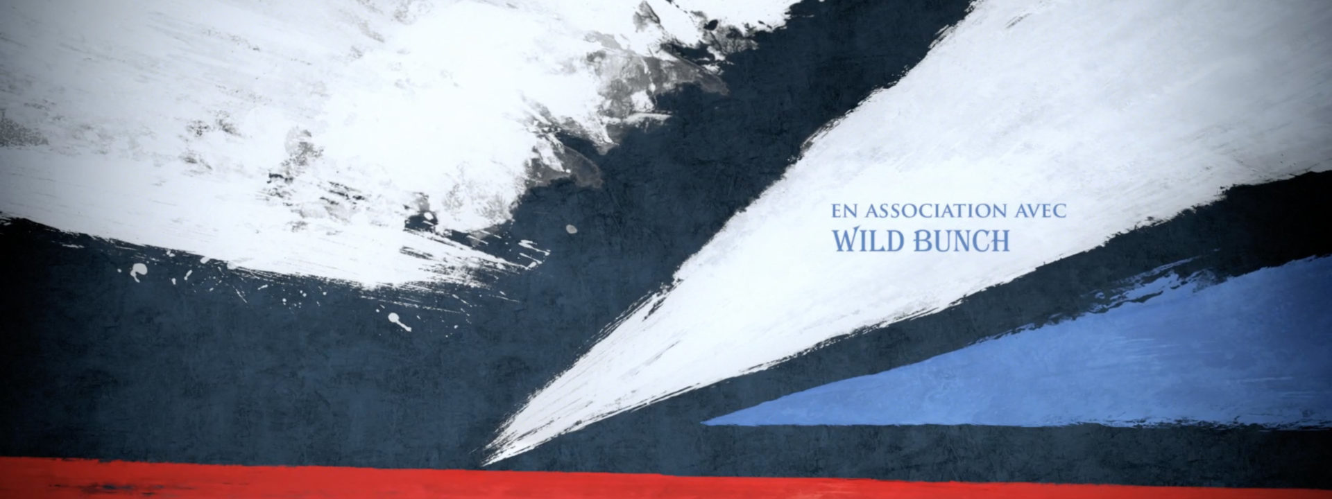
Drawing inspiration from the work of two great American abstract expressionist painters –Mark Rothko (to the right) and Jasper Johns– the final title sequence opens with overlapping strokes of white, blue and red paint, the colors of the United Kingdom’s national flag.
")
Astérix and Obélix: God Save Britannia (still)
ROYAL 3D WIZARDRY
The entire title sequence was designed in Real 3D, and with Lapierre having a strong background in CG meant that he was quite demanding on all CG aspects of the production. The immaculate attention to details shows –in the dented surface and realistic sheen of the pure golden crown, the dispersion of light and the luster of its many precious stones, and the royal purple velvet cap with ermine border– everything is rendered in stunning, photo-realistic detail. “Thanks to the Mac Guff‘s CG team lead by Sylvain Potel,” adds Lefournier.

Astérix and Obélix: God Save Britannia, Animatic vs Final Render

Modelled exactly after the real thing, the 3D model of St Edward’s Crown was edited to accomodate better framing when panning across. “We wanted less perfect, less ‘CG,’ so we altered the symmetry and added some randomness.”
TYPE INCEPTION

Astérix and Obélix: God Save Britannia, Typeface Selection
Like many title designers Lefournier is obsessed by typefaces. “I tried many. We finally agreed on the Algerian D Font I had picked,” he says, “The funny thing is that I considered it to be a rather rare and elegant typeface. But then l started to notice the same typeface used on the fronts of some Parisian bakeries and shops. Maybe it was unconscious inspiration, some kind of Type Inception.”
“FORGET THE SCORE, WATCH THE TITLES”
…kids Lefournier, when I mention the offbeat score, which does not seem to orchestrate any kind of meaningful connection to the visuals. “We had no latitude on the choice of this soundtrack (…) We asked the composer for timing adjustments but there was some confusion and the composer worked on an old animatic, so it ended up with timing issues and I’m not satisfied with it.”
We will no doubt here more from this truly dynamic duo. Lefournier says he hopes to to see title design become an increasing field in France and Europe, “It is still underrated compared to what it is in the US.”
Article: Remco Vlaanderen, © Submarine Channel 30 October 2012.
Year of production
2012
About Jean Baptiste Lefournier and Camille Bovier Lapierre
Camille Bovier Lapierre and Jean-Baptiste Lefournier are two upcoming French designers-directors based in Paris.
More about Jean Baptiste Lefournier and Camille Bovier Lapierre
Full credits
Title Designers
Jean-Baptiste Lefournier & Camille Bovier Lapierre
Mac Guff: VFX Producer Rodolphe Chabrier (CEO of Mac Guff), Line Producer
Delphine Domer, CG Lead Sylvain Potel, Compositing Solène Collignon, Render
Benjamin Ruiz, Layout & Lighting Carine Gillet & Sylvain Potel, HD Textures for Camap
Jean-Baptiste Lefournier & Camille Bovier Lapierre, Camap & Strokes Texture Animation
Manuel Quinto, 3D Modeling Alicia Etourneau, Texturing & Hair (Crown) Benoit De Longlee.
Director (movie)
Laurent Tirard