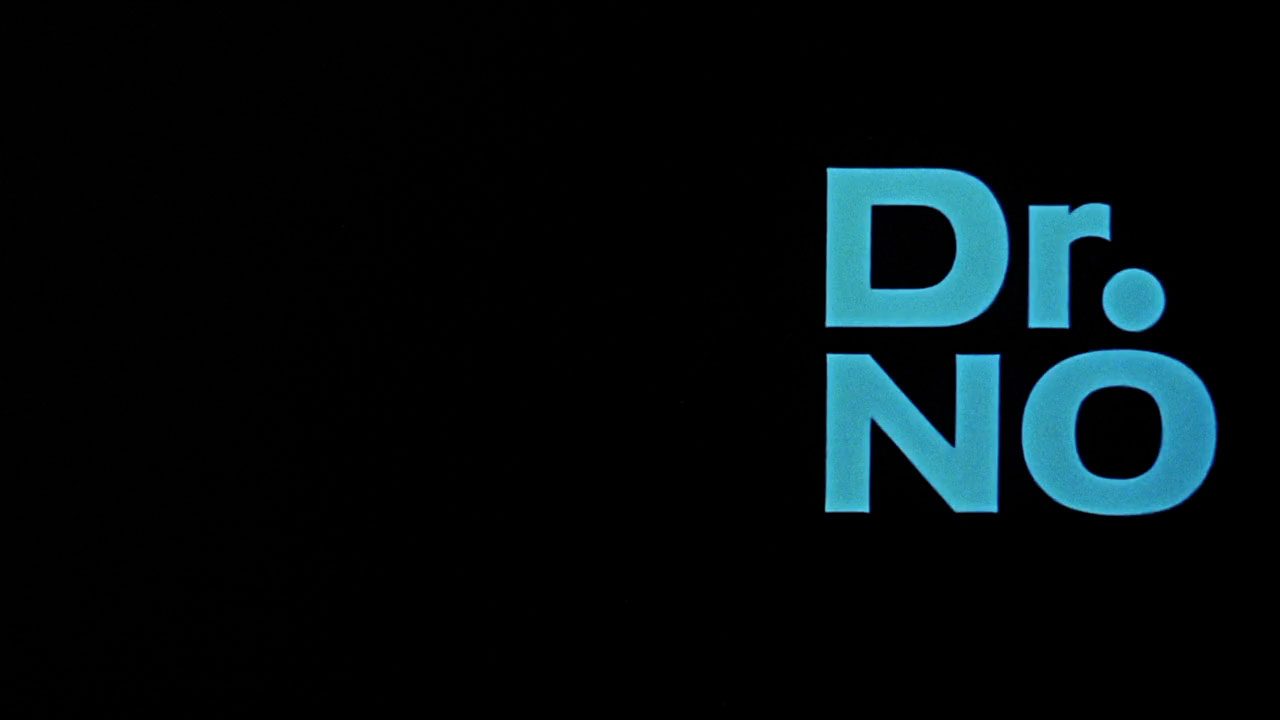
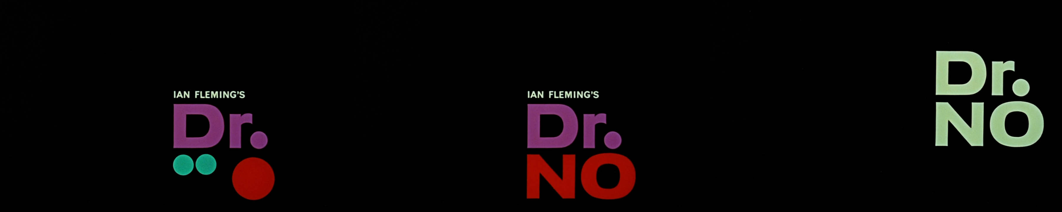
When you see a man in a tuxedo holding a gun, you immediately identify him as James Bond. When you see the first few seconds of the gun barrel sequence, you know that a Bond movie is about to start. Sexy silhouettes? John Barry’s 007 Theme? Bond! Maurice Binder designed the titles for the first Bond movie, Dr. No, in 1962, creating the visual elements that became icons of popular culture. Liselotte Doeswijk takes an in-depth look at the Bond title sequence that had such a huge impact on the Bond franchise and on title design in general.
The mid 1950s was an interesting time for title sequences. The growing popularity of the rivaling medium of television prompted film studio’s to rethink their promotion strategies. Saul Bass was making waves with his modern designs for Otto Premiger’s films. Maurice Binder, who was five years younger than Bass, had over ten years of experience with film publicity and design at Universal and Columbia, and saw an opportunity for himself.
Before Bass, Binder, and others, it was not uncommon for a studio to have the poster, trailer and titles designed by different artists. A movie poster would often resemble other movie posters, rather than being part of a coherent visual strategy for the film. Binder could provide the total package; strategy and design for titles, trailers and print campaigns.
A MODERNIST APPROACH
At the time, American designers like Bass and Binder were strongly influenced by European modernism. Binder reportedly owned hundreds of art catalogues and had an excellent collection of early modern art, including works by Matisse and Picasso. 1 European modernism was considered elegant and sophisticated, echoing high-brow sentiments about ‘the old continent.’ The geometric, abstract patterns of modernist art and design struck a nerve with young and progressive Americans, who were part of a progressive subculture that would listen to jazz and look at pop art. Because of these associations, modernist design became interesting for commercial purposes.2
Maurice Binder
Born in New York in 1925, Maurice Binder worked his way up at Macy’s Department store to become an art-director. After serving in WOII he moved to the West Coast of the US where he worked in film promotion. In the late 1950s he oversaw the West Coast Advertising Department of Columbia Pictures. Binder also started working with director Stanley Donen designing outstanding title sequences for The Grass is Greener (1960), Surprise Package (1960), Charade (1963) and Arabesque (1966), among others.
The modernist style was appropriated in American product design, advertising, graphic design and architecture, and the style of German abstact film (or Absolute Film) of the 1920s influenced designers working in the field of film and television in the 1950s. The European modernists believed their functionalist designs would contribute to a better world, but the American appropriation was decidedly more pragmatic. Reducing a film to one stylish and modern-looking visual metaphor was a very effective method of promoting a film. Bass’ metaphors, like the stylized arm he created for the for The Man with the Golden Arm (Otto Preminger, 1955), functioned somewhat like a logo for the film. It’s a bold, recognizable and distinctive symbol that works across all media – be it the trailer, the poster and the titles. While the abstract style added a little bit of sophistication and exclusivity to the popular mass medium of film.3
HIRING BINDER
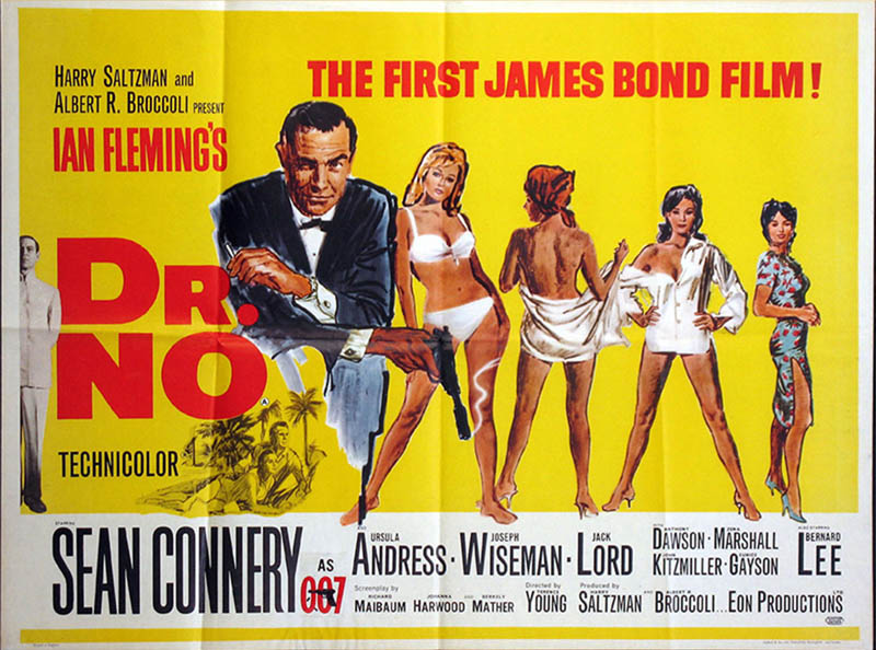
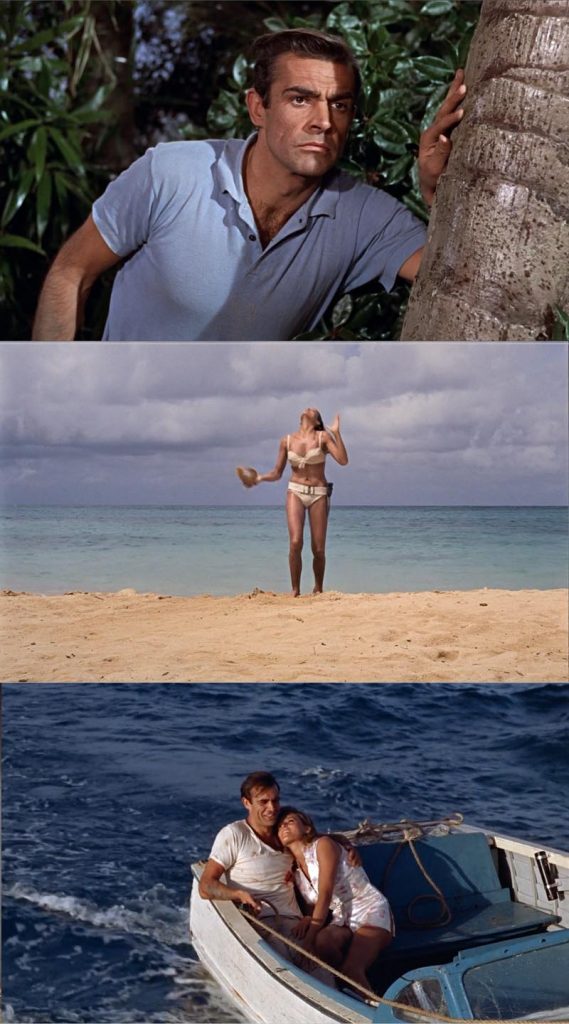
In the early 1960s, Canadian producer Harry Salzman and American producer Albert R. Broccoli had formed a partnership to bring Ian Fleming’s spy novels to the movie screen. Fleming had written quite a few novels with the James Bond character that were successful in Europe and America. The two producers saw potential for a box office hit and sequels and took the promotion of the film very seriously. They had already decided that the focus of the promotion would be the familiarity of the Fleming novels and the alluring pictures of first Bond girl Ursula Andress in bikini, made during the film shoot in Jamaica.
The story goes that Saltzman and Broccoli asked Binder to do the titles for Dr. No the day after they saw his titles for Stanley Donen’s The Grass is Greener (1960).4 Binder’s witty and endearing sequence featuring babies interacting with the credits completely outshone the movie 5, which convinced the producers they needed Binder’s talent.
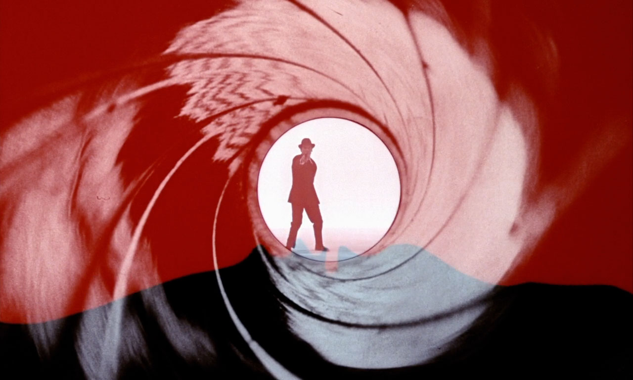
THE GUN BARREL SEQUENCE
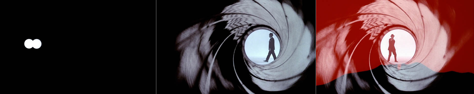
The sequence starts with blinking white dots on a horizontal line that reveal the first credit, “Harry Saltzman & Albert R. Broccoli present”. The mysterious and strange electronic sounds (omitted in later sequences) suggest something scary and high-tech might be going on. And indeed, the villain, Dr. No, plots to disrupt rocket launches with atomic powered radio beams. The white dot becomes the end of a gun barrel.
According to an interview with Binder shortly before his death in 1991, this part of the title sequence was done very close to the deadline of a presentation to Saltzman and Broccoli. Binder got inspired after he had found some generic white round price tag stickers which could represent bullet holes. He drew up the storyboard for the twenty-second sequence that featured Bond walking through a white price sticker, firing at the viewer, and the screen turning red. Salzman and Broccoli liked it.9
Binder used a pinhole photograph of the actual inside of a gun barrel. He then filmed it, matted the circle out, and filled that with a shot of Bond –played by stuntman Bob Simmons– walking and then pointing and shooting. Blood starts to run down the screen, the barrel wavers as the assassin falls down.
The gun barrel sequence serves as an introduction, but also as some sort of disclaimer to prepare audiences beforehand for the merciless side of Mr. Bond. Here we have a brand-new hero, one who does not hesitate to use his licence to kill, even when his opponent is unarmed, as is the case in one of the scenes in Dr. No.
Some film critics compare the gun barrel sequence to the final shot of The Great Train Robbery (E.S. Porter, 1903), in which one of the villains points his gun and shoots straight at the audience. This shot doesn’t have a narrative function, it’s just there to excite and shock the audience. The same could be said of the gun barrel sequence. A point-of-view shot like this draws the audience in by putting them in danger in an almost physical way, something that Ian Fleming‘s novels could never achieve.10
Dr. No was the second of Ian Fleming‘s spy novels featuring the James Bond character to be made into a feature film. Casino Royale was (not very successfully) made into a television show in 1954. The way the show was introduced bears some resemblance to the Dr. No opening. The viewer travels into a camera though a long barrel where the credits appear, as the shutter opens and closes. In fact, many mistook (and still do) the gun barrel in Dr. No for the lens of a camera.
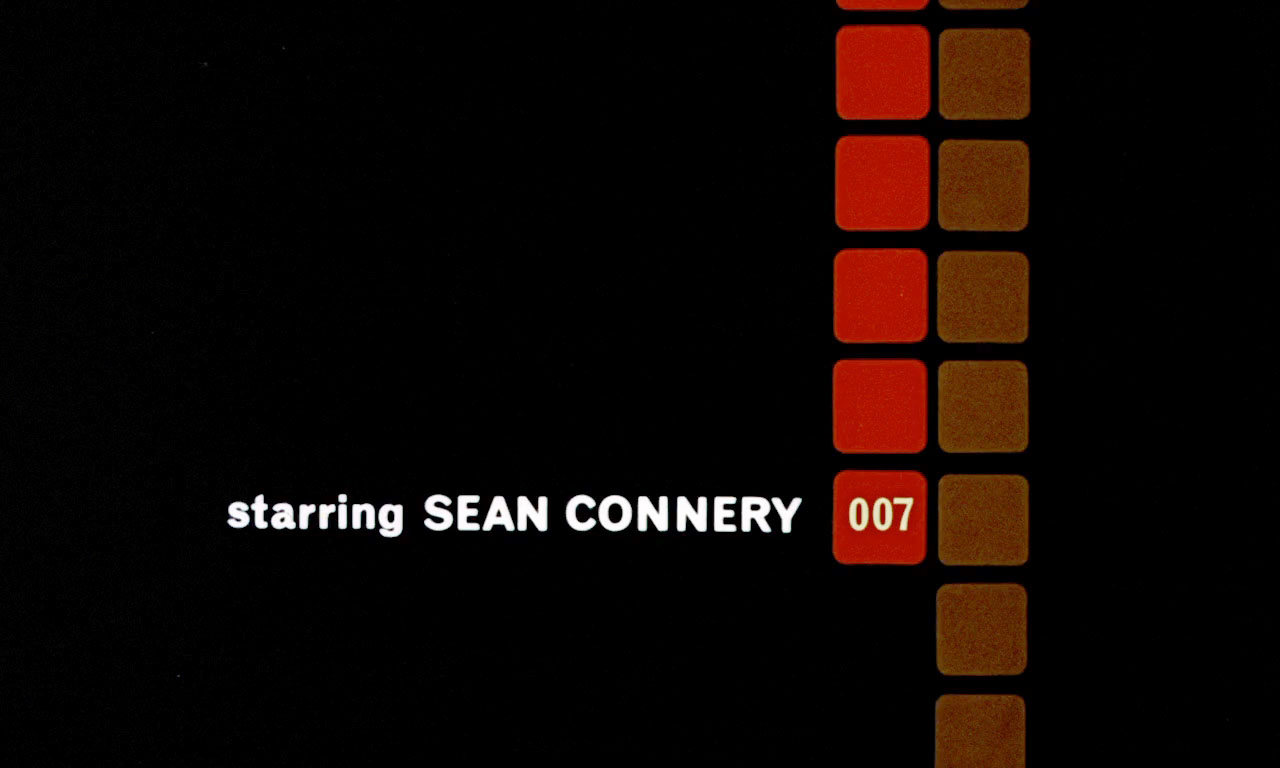
It’s interesting to note that the actor in the fun barrel sequence is not Sean Connery but stunt man Bob Simmons doubling as Bond. Simmons doesn’t even resemble Connery, but the dinner jacket and the gun are enough to signify him as Bond. In a similar fashion, the gun barrel sequence became a pars pro toto for the whole Bond phenomena. All Bond films up till now feature the gun barrel sequence. It’s been featured in the movie’s promotion and merchandise, and has spawned numerous parodies and fan remakes. It is possibly the most recognized motion design piece worldwide. And it even has its own –very extensive– Wikipedia page.
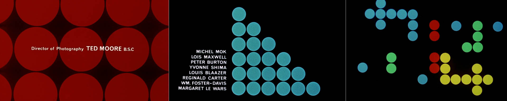
Credits
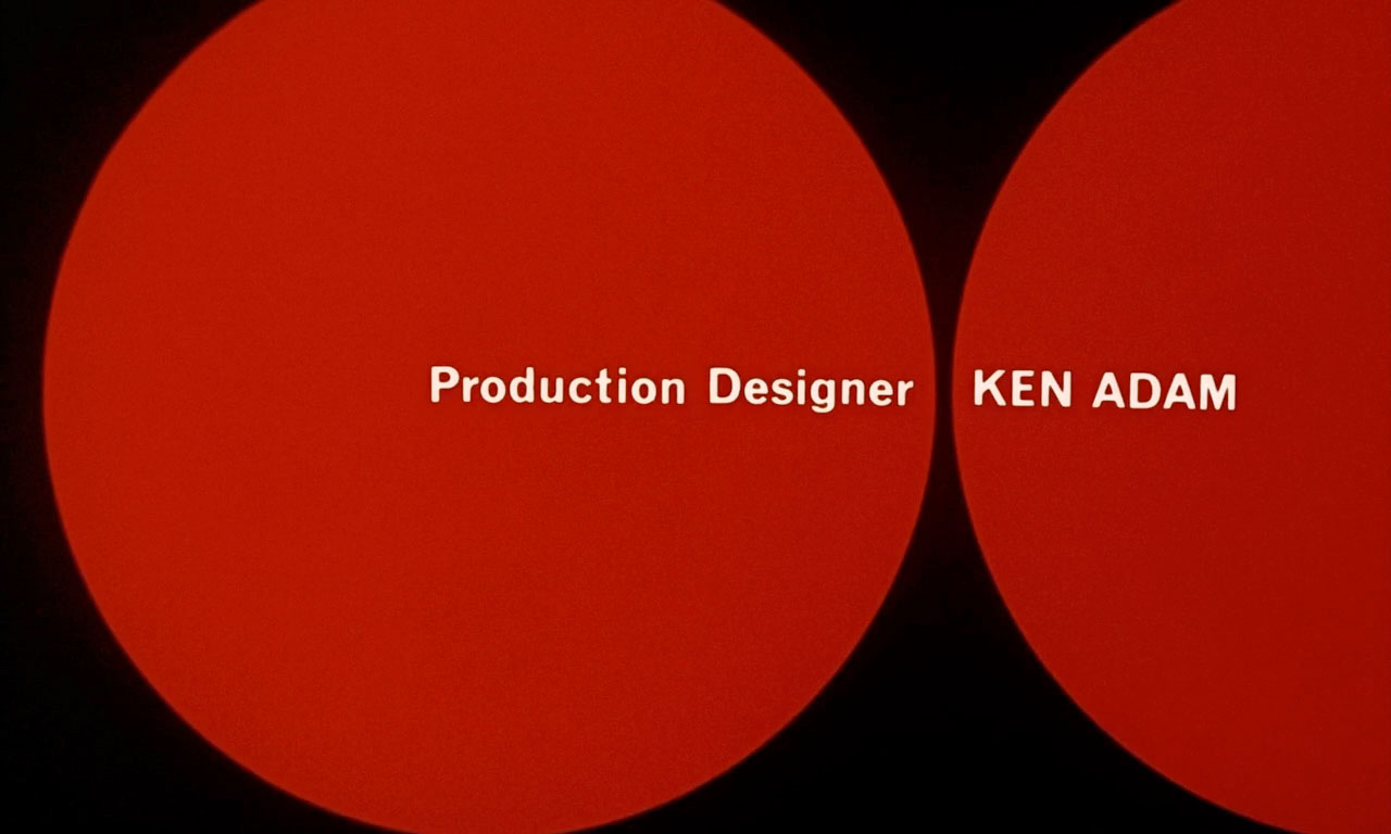
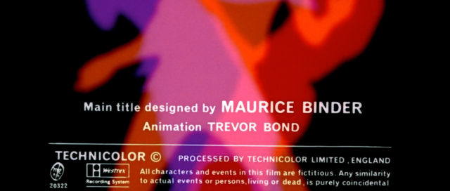
Main Title Maurice Binder
Animation Trevor Bond
Soundtrack composer Monty Norman
Arrangement John Barry
Producers Harry Saltzman and Albert R. Broccoli
Studio EON Productions
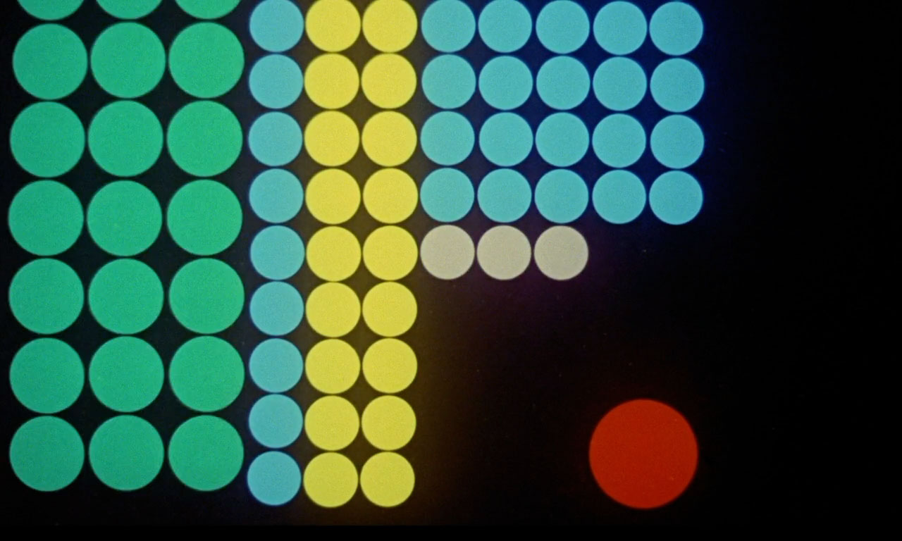
Animated Dots
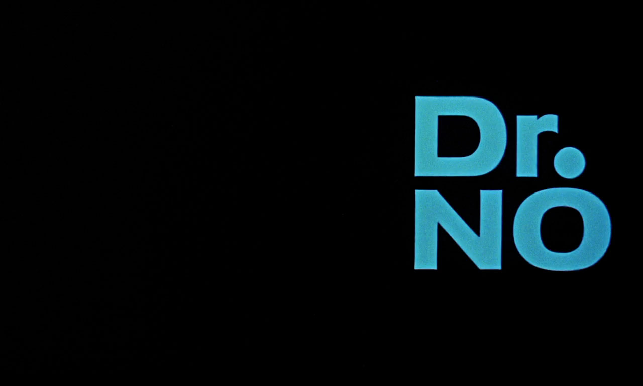
After the sound of the shot we hear the James Bond theme, composed by Monty Norman, for the first time. White dots turn red and other colors and smaller dots appear. The dots blink, change color and position and form patterns in the same high pace as the music score. The gun barrel dot eventually becomes the ‘O’ in Dr. No. Sean Connery’s title stands out because it is introduced by squares with the number 007 identifying him as the main character James Bond.
The dots are the same ordinary price stickers that inspired Binder to create the gun barrel sequence. Binder used a similar idea in the coming attractions trailer, which had blue dots appearing at the sound of gun shots. But the dots in the title sequence have very little to do with guns or violence. The animated dots, with their bright colors, the rhythmic animation and the underlying grid suggest that inspiration came from modern design, psychedelic pop-art and city nightlife. They represent optimistism, contemporary stylishness, fun and youthfulness, preparing the viewer for a different kind of excitement.
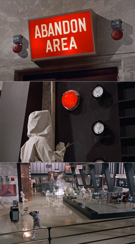
It’s possible to link the dots to Dr. No’s high-tech secret atomic lair with its giant computers with blinking lights and switchboards (computers in the 1960s did not have output screens yet). And there is definitely a link between the last red dots at the end of this sequence and the “Abandon Area” sign. The same could be argued for the James Bond theme that accompanies the dots.
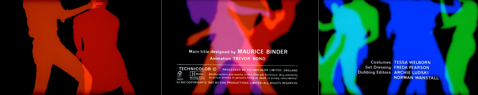
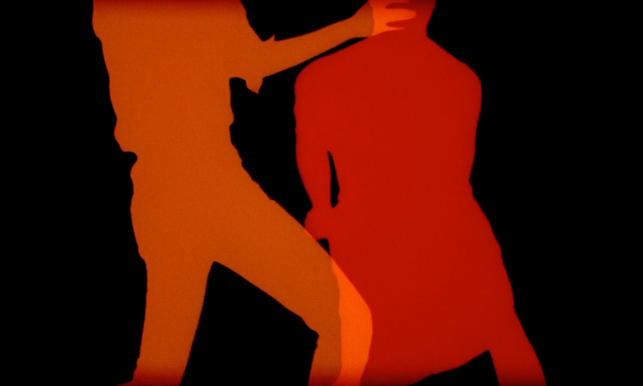
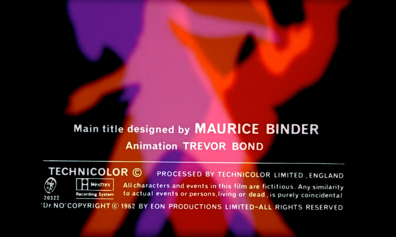
A red dot fades to a black screen with a red silhouette of a dancing woman. Other franticaly dancing figures appear, one in lavender, one in orange. Even more silhouettes appear as the colors change to blues and greens. Although visually the dancers could be from any nightclub in swinging London, the choice of music situates them in Jamaica. We hear a calypso drum beat similar to the music performed at the Jamaican open air club in the movie.
Binder is said to have wanted the silhouettes of the dancers to be animated, so they wouldn’t contrast with the animated dots. But this proved too time consuming. Binder’s practical and fast solution was to shoot the dancers on high contrast black and white film. These prints were then painted by the Special Effects Department at Technicolor.11 The animation with the white round price stickers and the background for the ‘three blind mice’ part of the sequence were also shot in black and white and painted afterwards, resulting in a beautifully bright and consistent palette of colors throughout the sequence.
The producers were always keen on getting a PG rating for the Bond films, so sex and nudity had to be suggested rather than shown. Binder’s use of silhouettes was a clever solution.
Looking back at the Dr. No sequence now, the dancing silhouettes look very modest and can be seen as a celebration of contemporary London club culture. The suggestion of sex lies mostly in the dancing style and focus on the hips. But in the early 1960s these types of representations were probably considered progressive and perhaps even provocative. This is 1962 after all, just a few years after Elvis Presley shocked the USA with his wild pelvic movements. The Summer of Love lied five years in the future, and the sexual revolution was just about to hit the UK.
The gun barrel sequence and the use of female silhouettes would become iconic for the Bond title sequences. Naked or scantly clad female silhouettes would dance, swim, do acrobatics, smoke, fight, or jump in all Bond sequences to come. These anonymous female bodies usually don’t refer to specific characters in the films and are very similar in body type. This applies less to the Dr. No silhouettes (they are dressed and one might actually be male), but by focusing on the hips, the heads of the dancers are kept out of frame. These are all classic aesthetic means of facilitating a voyeuristic experience for the male viewer.12
The Bond films are full of these types of representations, most notably the scene where Bond secretly watches bikini clad Honey Rider (played by Ursula Andress) walking out of the sea. And like the silhouettes in the titles, the female characters in the Bond universe are interchangeable, always young, attractive and willing. So this part of the sequence is progressive and misogynist at the same time.
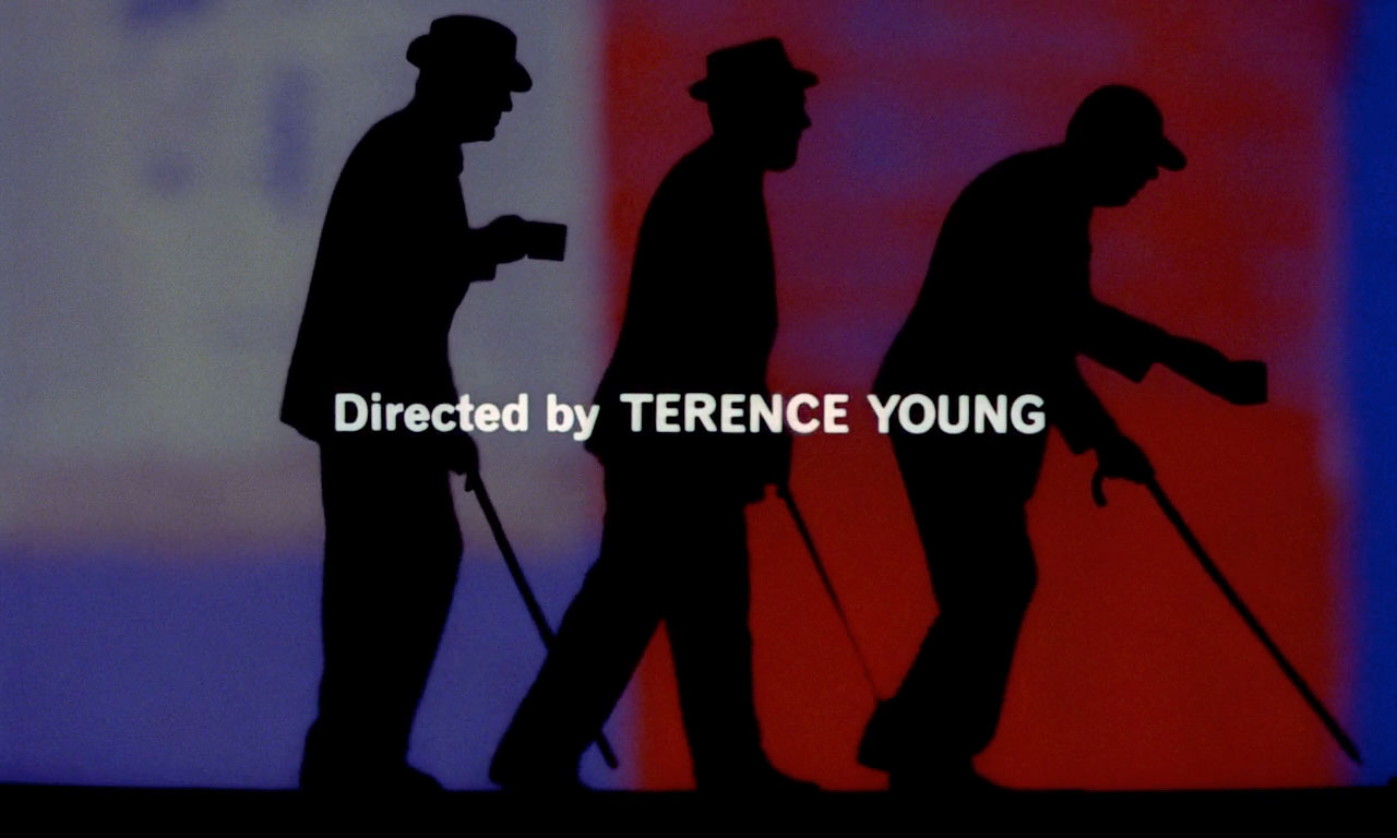
Three Blind Mice
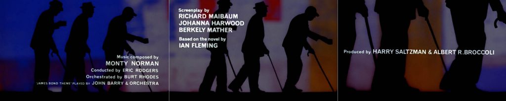
The dancing silhouettes fade to the final scene of the title sequence which is accompanied by another Calypso song. Three old blind beggars walk across the screen, with a walking stick in one hand and a can of money in the other. The song is based on the nursery rhyme ‘three blind mice’ with altered altered to fit the movie.
After the last credit for director Terence Young, the silhouettes fade to an image of the three men crossing a street in Kingston, Jamaica. We find out that they are not as harmless as they looked when they assassinate a British Intelligence agent, effectively setting the story in motion. This last part of the title sequence functions like a bridge between the ‘real’ story of the film and the stylish and sexy abstractions. Not as thrilling or seductive as the previous parts of the sequence, but it isn’t really a film scene either.
Monty Norman, inspired by the surf rock craze of the early 1960s, composed a surf rock tune for guitar. But Saltzman and Broccoli were not satisfied and asked jazz composer John Barry to rearrange the tune. Barry’s melodies add a disturbing twist to the otherwise cheerful guitar riff.
A SCHIZOPHRENIC TITLE SEQUENCE
The Dr. No title sequence goes from one extreme to the next. First we get shot and collapse, then we’re in a modern jazz club. When the red lights hint of danger, we get distracted by sexy dancers. And just as we were about to ease into the comforting tune of ‘Three Blind Mice,’ we encounter death again in the first scene of the film.
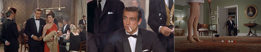
These quick changes of mood reflect the schizophrenic character of James Bond, who cracks witty oneliners while shooting an unarmed villain, gets into a dirty fight wearing a tuxedo, and has no problem sleeping with a woman who ordered to have him killed moments earlier. It’s these ambiguous elements of the Bond character that made this new hero so interesting. He is a hero, but he’s also a sadist, a misogynist, and a hedonist. It seems that Binder intented to visualize this ambiguity in the title sequence. His titles for Dr. No prepare us for the world of 007, where danger, death, fun and sex are all rendered very stylishly and sophisticated.
The first Bond film was a worldwide success and James Bond became the longest running and most successful film series ever. Binder’s first Bond title sequence with its female silhouettes, the guns, and the emphasis on style combined with popular music became iconic, and has been the main reference for all the Bond title sequences that followed, including the two main titles designed by Robert Brownjohn. All of Daniel Kleinman’s titles after Binder’s death were made in perfect understanding that what Binder had created for Dr. No was the point of reference. The gun barrel sequence eventually became separated from the main title sequence, but remains part of the Bond paratext. It’s arguably one of the most successful examples of a title sequence tying in with the branding strategy of a movie.
Article: Liselotte Doeswijk, © Submarine Channel
Links/sources
1 Pat Kirkham, ‘Dots and Sickles’ in Sight and Sound, December 1995: p. 10.
2 Lynn Spiegel analyses the link between modenism and popular culture in the fifties in the USA in TV by design: Modern Art and the Rise of Network Television, 2009.
3 George Stanitzek, ‘Reading the Title Sequence’ in Cinema Journal 48, no.4, summer 2009: pp. 44-58.
4 Kirkham, p. 10
5 Stanitzek, p. 51
6 It’s unclear when Binder moved to the UK, but it was probably around this time.
7 Kirkham, p.10
8 In Silhouettes: The James Bond Titles (John Cork, 2000) Video documentary by MGM
9 Pfeiffer, p. 200
10 Alexandre Tylski, ‘La saga James Bond. Des génériques (dés)habillés’ in Présences du cinema, May 2007: pp. 32-35.
11 Kirkham, p.10
12 Laura Mulvey analysed the male voyeuristic gaze in her essay “Visual pleasure and Narrative Cinema’ in 1972. Pfeiffer, Lee & Lisa, Philip, The Incredible World of 007: An Authorized Celebration of James Bond, Boxtree, 1995: p. 200.