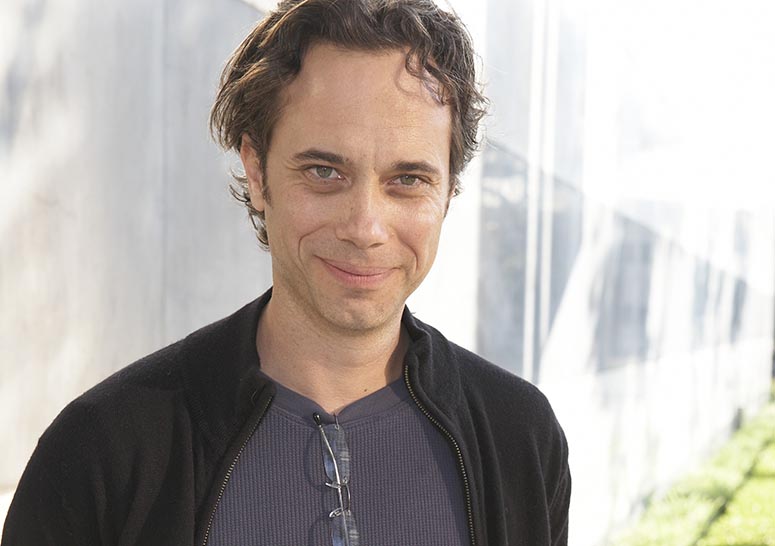
Main Title director Jamie Caliri won an Emmy award for Outstanding Main Title Design for his United States of Tara title sequence in 2009. We interviewed him earlier that year in L.A. about the making of that sequence and about his love for stop motion animation. And Caliri explains what’s so great about Woody Allen‘s title sequences. (7 min.).
First in a series of video interviews with Main Title designers recorded at the Flux/Forget the Film, Watch the Titles event at the Hammer Museum, L.A.
To embed or download this interview: vimeo.com/5816586
Year of production
2009
Full credits
Director
Remco Vlaanderen
Editor
Paul de Heer
Graphics
Madelinde Hageman, Raoul Matheron
Created and published by
SubmarineChannel.com
Recorder at
Hammer Museum, Los Angeles, May 2009
Links
Flux.netCourtney Taniguchi's report of the event
Jamie Caliri Watch the Titles event was a blast!Report and photos of the event on SubmarineChannel
Kudos to the team at watchthetitles! Great interview! I’m a huge fan of Jamie Caliri. For those who are also fans, Jamie will be speaking at motion09 this year (www.motionconference.com). While you’re at it, check out the recent motion.tv article on Jamie’s nomination for an Emmy. http://motion.tv/2009/07/28/jamie-caliri-nominated-for-emmy-united-states-of-tara/
Really nice done. Hope this one isn’t gonna be the last!!
nice commentary.
In regards to the BR and WA film titles. More often than not, the choices for those sequences back in the eighties and seventies were made from circumstances of the production and less from a big creative decisions. circumstances like budget, time, available technology, kind of drive those simple optical type title sequences…Also that period in title design was more or less a kind of down period. So my point is this, it’s easy to look back on those simple title sequences and admire and overlay a brillant genius upon them…but I believe those were choices that were made based on the huge constraints placed on the title designer, who would have loved to do something extremely more imaginative. I know because I have worked with people that worked on titles during that period and they told me so.
Anyway…using a serif typeface(Garamond?? LOL ) for a futuristic movie such as Blade Runner always bugged me. Also the kerning between the type in these movies is so horrible and dated. But anyone who couldn’t acknowledge that really isn’t a title designer at all.
A title designer is someone who makes use of THE TYPE (the titles) in an interesting and appropriate way. I expect a title designer to talk about the nuance of the typeface and how it relates to the movie.
In 1991, a 35mm dup of a 70mm early cut of Blade Runner screened in LA. As I recall, this early cut had a different title sequence. I remember a main title converging in the center of the screen with a more futuristic look. I recall thinking it appeared dated (1982). I was relieved they decided to keep it simple in the end.
Even if Caliri isn’t a type guy, His work stands on different terms. The Lemony Snicket’s titles would shine with a verity of type treatments. Think of how many title sequences were influenced by Lemony – Nanny McFee, and Enchanted just to name two . It wasn’t his type they were looking at. I have never found myself entranced by a title sequence simply because the typeface relates well to the movie, and I enjoy being entranced.