One of the most stunning main titles made for television in recent years have to be the opening titles of True Blood – a TV series created by Alan Ball, writer of American Beauty and creator of Six Feet Under. True Blood adopted a new twist on the vampire theme, as Ball successfully avoided the all too familiar goth horror territory of Bram Stoker’s Dracula, and stayed clear from the teen-angst-ridden, demon infested universe of Buffy. True Blood premiered in September 2008 on HBO.
True Blood is set in a small town in North Louisiana. Thanks to the invention of synthetic blood, which is sold as “True Blood,” vampires have now integrated in society, sharing the same living space as humans. Vampires, however, are generally distrusted and are treated as second-class citizens.
The show’s creator Allen Ball injected the series with countless subtle and not-so-subtle cultural and historical references to American society. This is reflected in True Blood’s opening titles. Made by Digital Kitchen (DK), the main title hints to the racial, sexual and religious themes that lurk below the surface of the show’s main storyline. DK’s creative directors Matt Mulder and Rama Allen take us through the process of creating the titles in our email interview.
HBO: True Blood Main Title Making Of
What is the main concept behind True Blood’s main title?
Matt Mulder, creative director: “When Alan Ball approached us to work on this sequence, he introduced two concepts that stuck with us through development and production. First, Alan had covered the serious and self-conscious drama in Six Feet Under. With True Blood, he very much wanted to break from that and express a pulpy romp that was entertaining and unmannered. Second, Ball tweaked Charlaine Harris‘s original stories, on which the show is based, to parallel the vampire-as-social-outcast characters in True Blood to the very real racial, sexual or social outcasts in America. In short we were to expose the soft pink underbelly of rural stereotypes to find what could be just under the surface.”
How do the classic vampire themes you explore in the opening sequence – sex, death and religion – relate to the show’s setting (Louisiana)?
Rama Allen, lead designer/concept co-creator: “We started by trying to tap into the roots of what we thought made the series compelling, and how those ideas could be communicated without simply mining the well trod visual territory of vampires.”
“After dipping ourselves in southern gothic, from Powers Boothe in Southern Comfort to digesting a pile of Harry Crews novels, one of the biggest ideas we latched onto was “the whore in the house of prayer”. This delicate balance of the sacred and profane co-existing creates powerful imagery. Editorially we collided the seething behind-the-curtains sexuality of the south into the fist pounding spirituality of Pentacostal healings to viscerally expose the conflicts we saw in the narrative of the show. Holy rollers flirt with perversion while godless creatures seek redemption.”
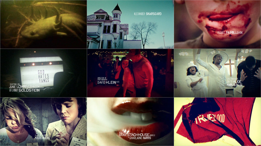
01.jpg "True Blood (still)")
Sex versus religion03.jpg "True Blood (still)")
“To house these juxtapositions we created an arc to the sequence. The piece extends from morning deep into the night, and as it does so it’s rhythms and content crescendo into increasingly darker and more aggressive territory. In the end, regardless of what kind of evils, sins or vices that were perpetrated throughout the night, there is a redemption through a midnight baptism. It is a cathartic release that allows both sinners and saints to begin the next day anew and is intimately tied to the core of several belief systems in the south, from Christian mysticism to voodoo.”
“In addition we wanted to explore pairings of religious and sexual themes with implied violence. During a healing a white preacher wraps his hand around the throat of a black woman. Flashes of writhing naked bodies could be lovemaking or rape. A woman thrashes violently, and is restrained, while in the (death) throes of the Holy Spirit. Another woman suggestively wraps and constricts a man with her legs at a bar… the whole sequence is peppered with moments like this and depending on the viewers perception they will have a different gut feeling in response to them.”
“When we thought of vampire representations, we also thought of nature as a predator, as a supernatural force, and as a parasite. Throughout the piece we speed ramped clouds to unnatural tempos, studied decaying animals, spliced in carnivorous plants, and even included prehistoric swamp creatures (the opening shot is of an animal called a mud dog or ‘hell bender’).”
True Blood Featurette by Rama Allen
Rama Allen on Vimeo: “An extended piece we made following the titles. The music was our original recommend for the sequence. Included are many of the pieces we wanted to put in the original, but simply didn’t make it into our cut.”
THE LOOK & FEEL: MORE GUMBO THAN FINE DINING
Mulder: “We decided early on, based on the exploratory work of designer Rama Allen and editor Shawn Fedorchuk, that a docu-style assemblage of footage would give us the rawness and impact we were after. Also it allowed us to treat the edit as more of a gumbo than a fine dining experience to heighten the immediacy of the sequence. Core influences for us were the writings of Harry Crews, the wonderfully powerful documentary ‘In Search of The Wrong Eyed Jesus,’ Roadhouse cinema by the likes of Lynch and Glaser, and a touch of Chris Cunningham influenced the edits of bodies intertwined either in pleasure or in pain.”
The footage seems to come from different sources. Was the documentary-style footage shot specially for the opening sequence?
Mulder: “We shot almost everything you see ourselves, the exception being some of the wildlife footage. Everything else we shot on location in Louisiana during a 4-day road trip in an RV, at a church in Chicago, in a dive bar in Seattle, and a stage also in Seattle.”
09.jpg "True Blood (still)")
Nearly subliminal images in the opening sequence04.jpg "True Blood (still)")
EDITING PATTERNS
Mulder: “Shawn Fedorchuk knew he wanted the edit to rumble through the swamps, wilderness and cultures of the south to eventually reach into the hearts and minds of it inhabitants. This voyeuristic look into the psychological landscape of the story of True Blood would allow its viewers to see a patchwork quilt of images stitched together by the fervor of religious fanaticism and repressed sexual energy. Eventually boiling over into an animalistic lust, our “human” elements take on beast-like qualities invoking the shows supernatural themes.”
“To create this rumbling edit, Shawn would cut the footage of humans, animals and insects into tiny slivers, dropping out frames so their movements felt jittery, jarring and beyond their conscious control. He wanted the actual cuts in the edit to create a seething feeling intended to be a paradoxical state of simultaneous rotting and rabid breeding. By colliding quick jerking movements with smoother slower ones, he would create a beautiful kind of lunging staccato effect. On top of this he would spatter nearly subliminal frames of blood drops throughout the edit as a visceral reminder of the show’s foundation.”
Motion tests developed by designers Ryan Rothermel and Ryan Gagnier
THE ‘TRUE’ FAMILY OF FONTS
Mulder: “‘True’ was inspired by handmade lettering that you would see on a roadside in the rural south… specifically, crude makeshift signage. These “naive” letterforms have an unrefined style reflective of the culture we wanted to unearth – much like a local dialect. Camm Rowland, the type designer, looked at a lot of post-Katrina signage as well. It had a sense of urgency and honesty that made it compelling… but the element of simultaneous anger and fear is what made it feel especially connected to the story of True Blood.”
“Camm made the type by hand with simple tools and scanned them in to create the True family of fonts… 8 in all. He ended up using “True Gothic” and “True Blade” for the show, both of which have 2 weights and alternate characters for each letter… helping it to retain the nuanced variations and flaws that make vernacular typography so beautiful.”
“Ryan Gagnier developed a great treatment for the final logo reveal – a sort of pulsing, skin-peeling, visceral experience. He approached it with the same kind of crude, DIY attitude as Camm took with the type design so it compliments the both the content and the type very well.”
07.jpg "True Blood (still)")
Archival footage suggesting race related social unrest
Article and interview: Remco Vlaanderen, © Submarine Channel, 25 March 2009. Last update: July 3, 2012.
This interview first appeared on Watch the Titles, and has been republished on several other websites.
Year of production
2008
About Digital Kitchen
Digital Kitchen (DK) is a creative agency that focuses on film production, experiential design, motion graphics, brand identity, and interactive work for marketing and entertainment. DK has offices in Seattle, Chicago, New York and L.A.
Full credits
Production company (titles)
Digital Kitchen
Client
HBO
Creative directors
Matt Mulder, Rama Allen
Live Action Direction
Rama Allen, Morgan Henry, Matthew Mulder, Matt Clark, Trevor Fife
Designers
Rama Allen, Shawn Fedorchuck, Ryan Gagnier, Matthew Mulder, Camm Rowland, Ryan Rothermel
Compositor
Ryan Gagnier
Editor
Shawn Fedorchuck
Producers
Morgan Henry, Kipp Christiansen, Keir Moreano
Executive Creative Director
Paul Mattheaus
Executive Producer
Mark Bashore