STARS ALIGNED FOR SE7EN’S MAIN TITLE
“It happened at exactly the right time,” says title designer Kyle Cooper, when asked to give his perspective on the impact of his seminal title sequence for the 1995 movie Seven. “It kind of set a record.”
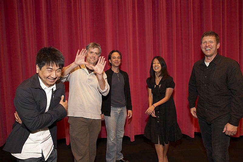
We meet Kyle Cooper for an interview at the Prologue studios in Venice Beach, L.A. Housed in an inconspicuous modern office building, the studios are just a few miles from the infamous Venice Beach boardwalk in the perennially sunny Californian capital. The studio’s office manager takes us on a tour.

On the second floor, a lofty studio plays host to a team of designers, modellers, and assorted artists, looking busy behind their state-of-the-art flat-screens. The blinds are pulled down, tempering the glaring sunlight from outside. Throughout the smaller, glass-walled offices, myriad officious-looking people conduct meetings that we wish we could listen in on. Danny Yount – one of the designers hired by Cooper – is talking on the phone in his office.
On the ground floor, in one of the studio spaces, we walk past a large green screen which we borrow for an hour for video interviews with both Danny Yount and Kyle Cooper. Cooper, casually dressed, is a serious man with a meticulous vocabulary, often rephrasing his thoughts and ideas. He exudes perfectionism.
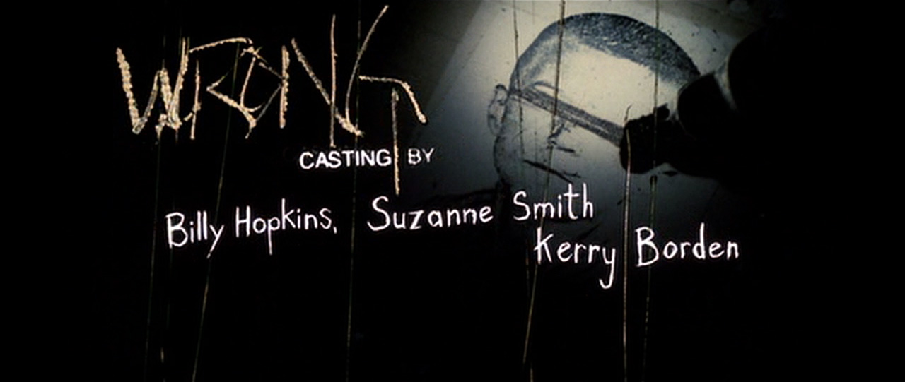
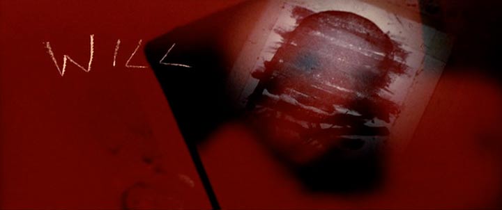
Kyle Cooper’s title sequence for Se7en is a landmark of visual culture, its influence ranging from graphic and motion design, to film, music videos, advertising and even media art.
Main title sequences were behind of what was happening in print in terms of typography and music videos and commercials.
Cooper thinks that Se7en was good because it felt like the rest of David Fincher’s movie.
“David Fincher is so in touch with every aspect of every one of his movies, and he’s very in touch with what every single person on the crew does. In other words, David Fincher knows better what the visual effects supervisor is supposed to be doing than the visual effects supervisor. He knows better then what the DP [director of photography] is supposed to be doing than the DP, and that extends into the main title. That’s why it doesn’t feel like a disembodied scene. It feels like it’s there to set up the killer, who doesn’t get introduced until the third act.
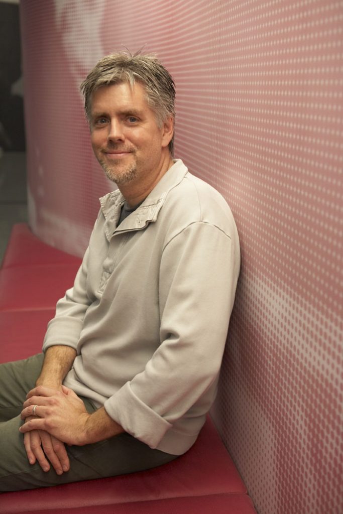
Kyle Cooper

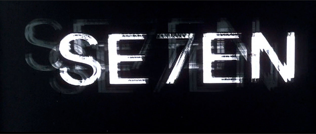
Title designer Kyle Cooper has been credited as the man who revitalized the title sequence as an art form. His groundbreaking title sequence for Se7en (1995) changed the way we look and think about title design today and is arguably the most imitated main title ever made. The work was hailed by New York Times Magazine as “One of the most important design innovations of the 1990s”.
According to Cooper, several factors contributed to the success of the title sequence. The fact that the movie was successful – a genre classic, in retrospect. The fact that Angus Wall is the editor and Harris Savides is the DP. “All of these stars kind of aligned and it happened at the right time. Someone else can do a brilliant main title now, but if the movie is not so good, it doesn’t get talked about that much.” Cooper pauses for a moment.”
“It seemed to me that when Saul Bass did The Man with the Golden Arm everybody said ‘Wow! Main titles can be more then just this utilitarian thing that we have to get out of the way.’ Somebody does something and it reminds people of what the potentialities are in a particular field. That’s what people have said to me about Se7en – they saw it and it made them want to be a title designer. A lot of that was about timing. Main title sequences were behind of what was happening in print in terms of typography and music videos and commercials. They felt a little bit dated. In the last fifteen years, myself and the designers that I’ve worked with have tried to be in touch with what else was happening creatively and to do main titles that were raising the bar.”
The Golden Arm, and maybe Se7en broke that record. You can break the record that Se7en set, but it seems a little harder now to do a main title that will cause everybody to sit up and take notice, in light of the fact that we can do things now that are so high-end, and there are so many people trying to do them. Danny Yount is doing titles that I think are fantastic. Jamie Caliri did Lemony Snicket’s and there was a lot of murmur about that, but it’s just a little harder. It’s harder for me too.”
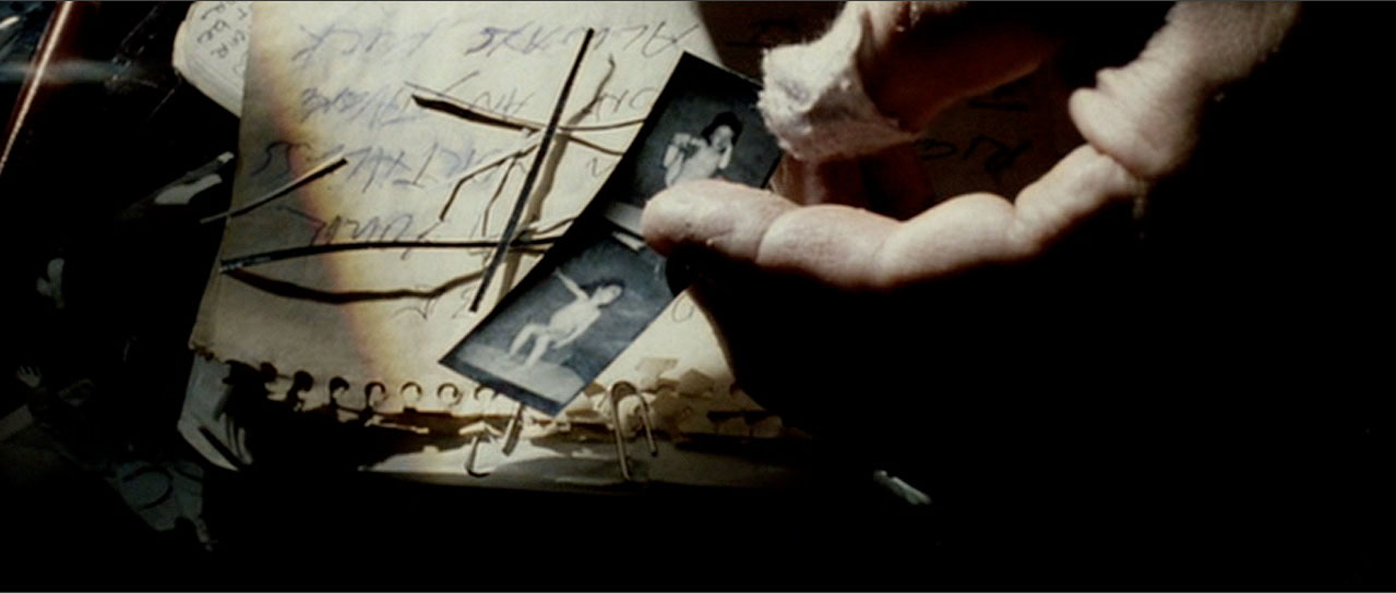
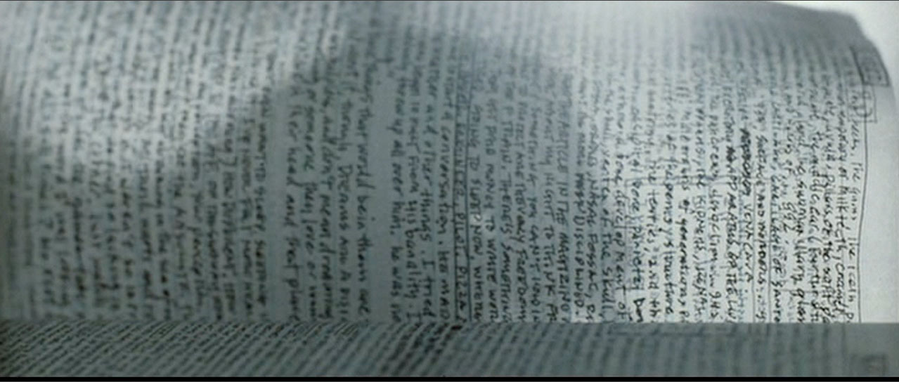
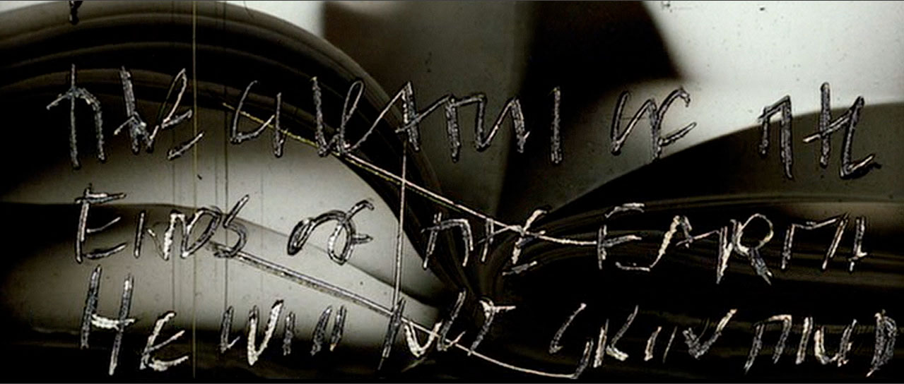
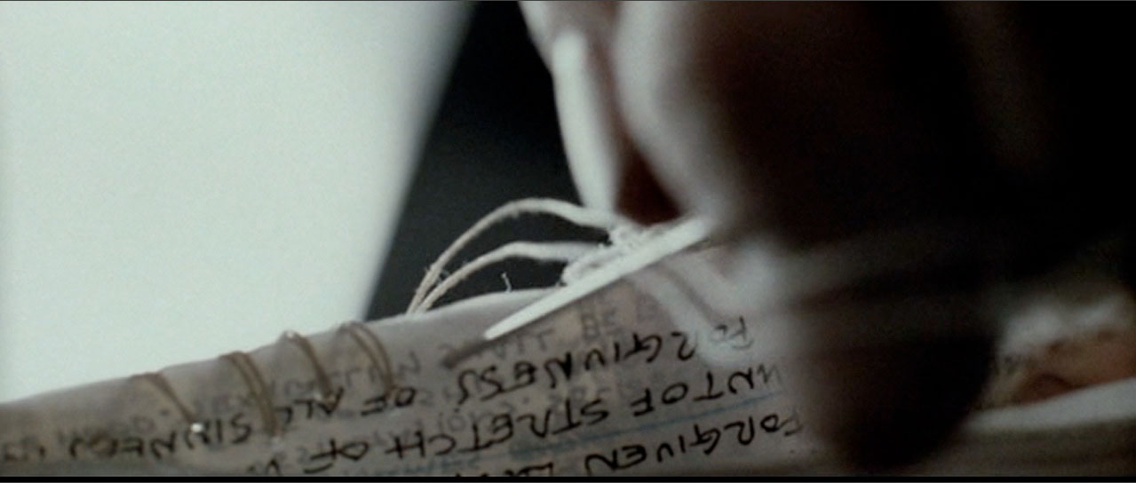
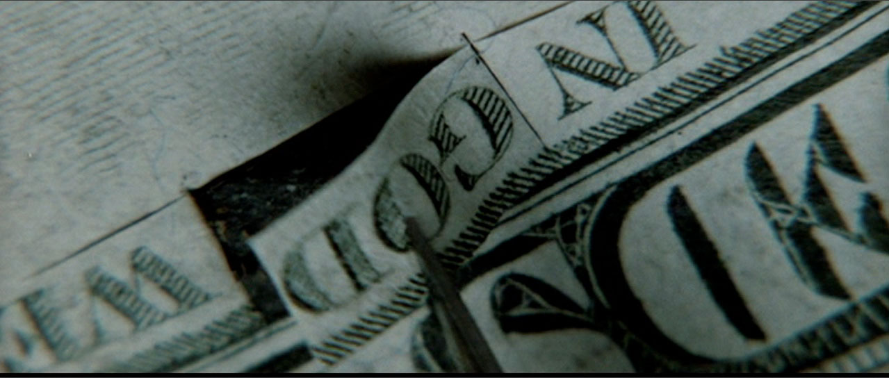
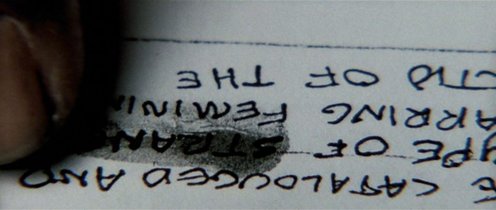
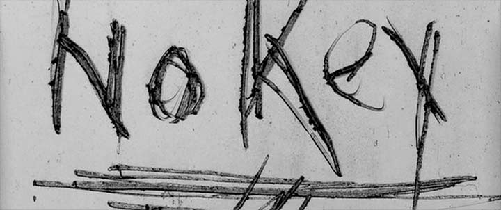
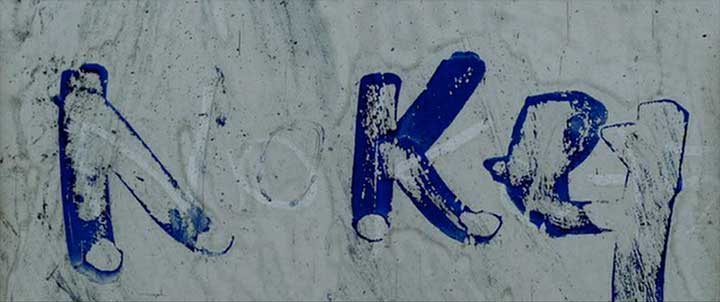
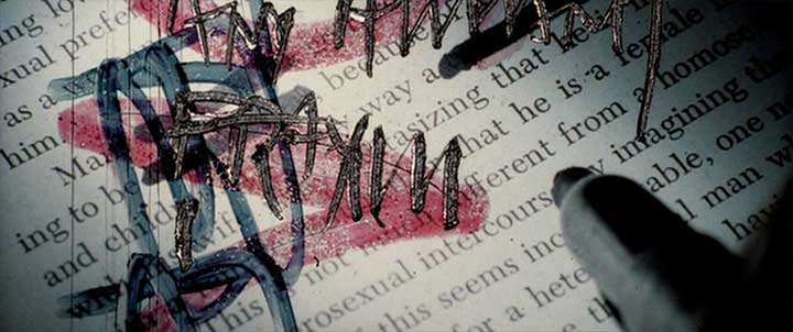
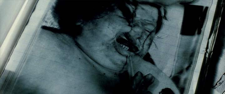
SUBLIMINAL IMAGERY
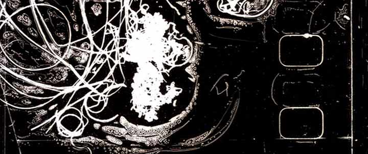
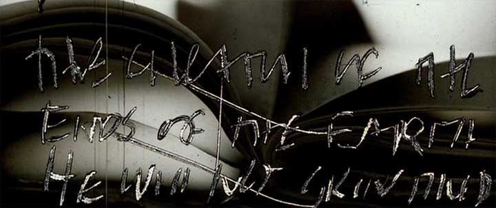
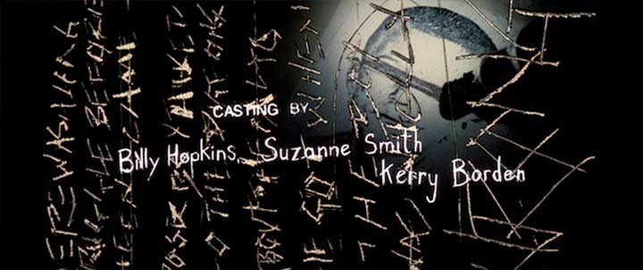
Playing the main title frame by frame will unveil numerous frames containing seemingly random codes that suggest that there is a system at work and obsessive messages and whole texts scratched into film.
“I also think that the cultural climate is such that it’s a little more challenging now. We had the desktop publishing revolution and the desktop filmmaking revolution, and now we have the Internet distribution revolution. So anything we make is available right away. You make something now and it’s out there.”
What other people say
Brilliant, in concept and hugely complex, this sequences makes uses of cinematic and graphic influences that were not, and are not, in the reach of just anyone. So-called typographic deconstruction was -and still is- a seminal influence in modern-day graphic design with followers and detractors, and its arrival to the particular world of credits bears one name, Kyle Cooper.
Gemma Solana and Antonio Boneu in Uncredited – Graphic Design and Opening Titles in Movies, BIS Publishers, 2007.
Interestingly, Cooper’s description of his own creative absorption parallels that of John Doe, the serial killer in Seven.
Andrea Codrington in Kyle Cooper, Laurence King Publishing, 2003
You can see jagged, back-lit type in every truck commercial. I mean, get an idea. Seven is about a serial killer. It’s not about a four-stroke sport utility vehicle.
Peter Frankfurt, quoted in an article by Joe Shepter about Imaginary Forces.
Directors don’t call on Cooper for a signature style; they hire him to dig under the celluloid and tap into the symbolism of a film. That aptitude first became apparent in 1995, with the abrasive and highly stylized intro to David Fincher’s Se7en.
Jon M. Gibson, The Dark Genius of Kyle Cooper, Wired, issue 12.06, June 2004.
C24.jpg)
Interview: Femke Wolting and Remco Vlaanderen, Los Angeles, May 2009. Last edit: 18 November 2019.