Now here’s a title sequence that does exactly what it should — perfectly evoke the meaning of the title and plot of the movie into strikingly symbolic visuals. The deceptively simple-looking opening and closing titles are not just a stylized intro in the form of an animated OS desktop interface — they elevate the viewer into the state of mind of the film and the story experience.
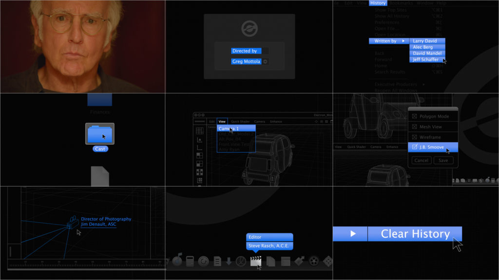
Creative Director Aaron Becker takes us behind-the-scenes and discusses cascading menu’s, collaborating with Larry David (pictured), and ensuring that titles tell a story. Plus, see the original pitch concepts, storyboards and motion tests. ABC
For a film about a former Silicon Valley electric car exec who tries to overcome past mistakes, the opening titles appropriately introduce the major themes in the movie — you know there’ll be a futuristic car, and someone looking to erase history. We spoke to Creative Director Aaron Becker of Becker Design, who teamed up with L.A.-based company Level 256 VFX. Brought onto the job by Executive Producer Seth Kleinberg and L256 VFX Owner/Creative Director Scott M. Davids, together they pitched and produced the main titles and main on end title sequence that kick off Larry David’s newest film, Clear History.
Watch the Opening Titles below, or read on for our in-depth interview with Aaron Becker.
ERASING YOUR PAST
“’Clear History,’ as Larry and Greg explained, is the main character’s attempt to cleanse himself of his past mistakes, as one would ‘clear’ the history of a web browser. The story is really all about his attempt to do this, because erasing one’s past – especially with our lives being so thoroughly documented online – is nearly impossible.”
Initially, however, there was speculation that the title was misleading, says Aaron. “So, there was an initial brainstorm session with Greg as he wanted the sequence to portray the meaning of the title Clear History.
RESEARCH


“We were finding a lot of inspiration from our research into the design, functionality, navigation and animated elements seen in a wide range of pre-existing operating systems. It was important that we create a style that paid homage to this history, but also one that would have a unique look unto itself.
“We knew that we had to develop a pitch that used the OS vernacular reminiscent of contemporary Mac culture, but it was also important that the treatment be stylized and sophisticated. We showed them a series of options in our pitch, ranging from early OS design language (partly because the film starts in 2003) to contemporary, ultra-minimalist layouts of what alternate user interfaces might look like if Apple’s OS designers had gone in another direction. We studied the functionality of cursor interaction on some old and new operating systems to get a sense of what combination of style and movement would best suit the overall ‘Clear History’ metaphor.”
“We showed some initial motion tests in our pitch meeting which Larry and Greg seemed to like; at the very least, it gave them a good idea of what we would be able to produce.”
MOTION TESTS (Vimeo)
CASCADING MENUS
“When we initially met with the filmmakers it was only to design the opening 8 second title shot with the two cards ‘HBO Films Presents’ and ‘Clear History’. However, one of the concepts we showed was titled ‘Cascading Menu’, which showed the animation and OS-style functionality we were hoping to develop for their film. Our idea was to have the designators, such as ‘HBO Films Presents,’ complemented by its respective sub-menu counterpart, ‘Clear History.’ We said we thought it could be a fantastic opportunity to bookend the film. Greg and Larry agreed and we moved forward from there.”


IMPROVING THE CONCEPT
Thematically and conceptually
“The biggest philosophical departure from our original concept were some additional elements Greg wanted to include in the main on end title sequence. Because the film is about the success of one man’s (Jon Hamm) electric car company and another former owner’s failure to predict it (Larry David), Greg wanted to add contextual details to the desktop screen that further emphasized the plot of the film. He wanted to see wireframe graphics of the car, as if it was being designed in a “CAD”-like program.
“We are so happy that Greg asked for some of these details because once we created one new detail, we wanted to add more so that the realism of this digital world could truly be felt. Next, we incorporated desktop files, an Electron Motors screen saver logo, and customized cards for specific cast members, such as the digital 3D software camera for the Director of Photography and a planar axis for the Production Designer.”

This Post Pitch Storyboard has improved concept images, with notes on thematic and contextual details.
MUSIC
As I was walking down the street one day
A man came up to me and asked me what
The time was that was on my watch, yeah…And I said
Does anybody really know what time it is
Does anybody really care
If so I can’t imagine why
We’ve all got time enough to cry.
Chosen by the filmmakers, the track “Does Anybody Really Know What Time It is” by Chicago is fitting to the film given that the band Chicago plays a thematic role in the film. But the song also offers a deeper truth in questioning the concept of time and our obsessions surrounding it – what is really happening and why are we running everywhere, getting pushed around, and trying to get ahead of time. There’s a better way to live life.

TO WRAP IT UP
Becker notes that his and Level 256 VFX‘s shared fandom for Larry David and his former HBO show Curb Your Enthusiasm was one of the reasons they took on the accelerated schedule of the pitch in the first place, in that they were confident in how their sensibilities might fit within Larry and director Greg Mottola’s framework. That, and having Aaron fly out from Chicago was apparently worth it just to meet Larry.
We agree! Their passion and creativity for the project shines in the final presentation of the titles, which is already so more extensive than initially envisioned by the filmmakers.
Finally, big props go to HBO, who as usual go the extra mile and don’t skimp out on investing in great title sequences. As Aaron says, and I unwaveringly agree, “it speaks to their devotion to creating fully realized pieces of filmmaking, from start to finish.”
Becker Design – soon to be known as Filmograph – has had a busy year. Their titles for The Conjuring were recently released and featured at Art of the Title last week. Current and recently completed title sequences include Insidious: Chapter Two, Oldboy, and 13 Sins, among others.
Article: Katy Yudin, © Submarine Channel 4 September 2013.
Year of production
2013

Full credits
Client
HBO Films
Directed by
Greg Mottola
Creative Direction / Design / Animation / Compositing
Aaron Becker @ Filmograph (previously: Becker Design)
Main Title Producers
Seth Kleinberg and Scott M. Davids @ Level 265 Visual Effects
Music
“Does Anybody Really Know What Time It is” by Chicago