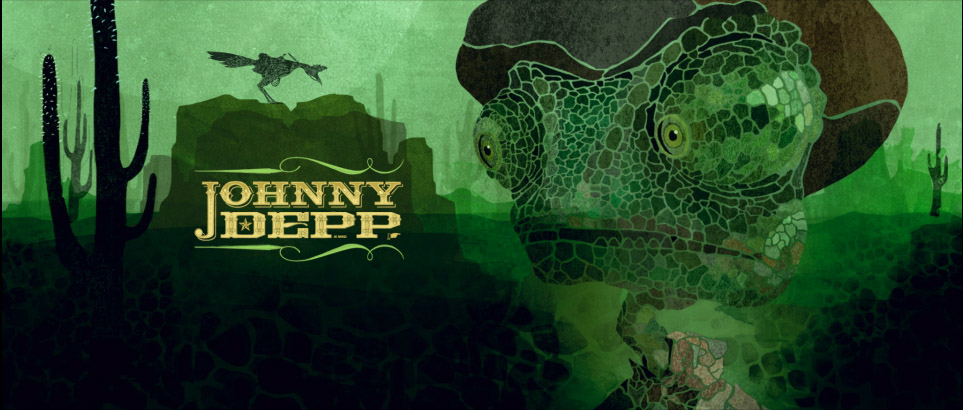
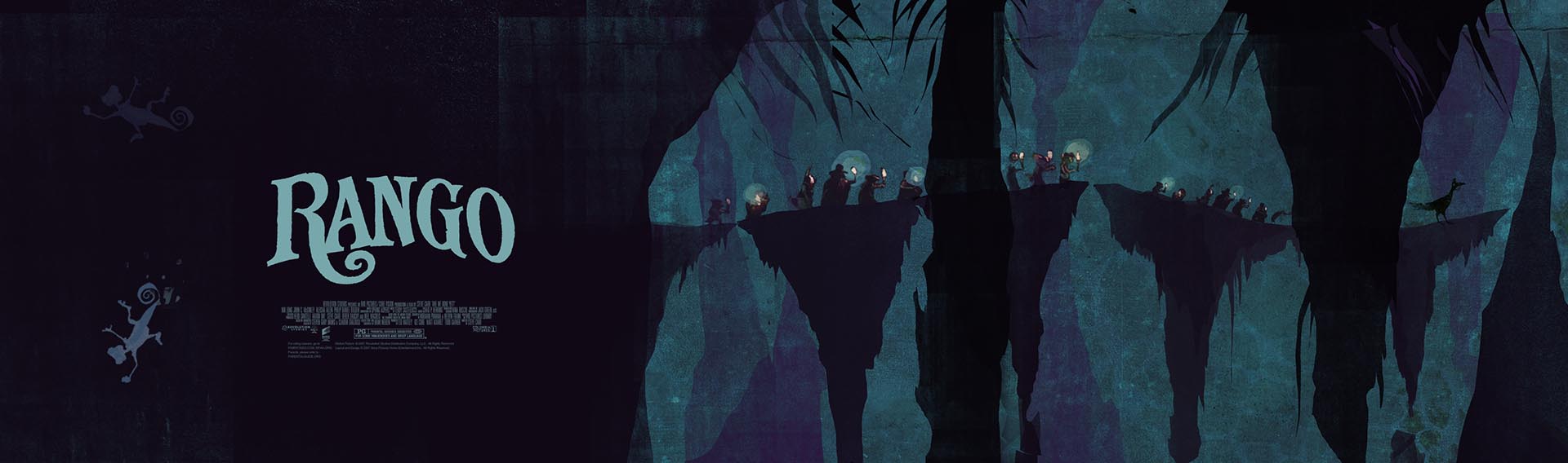
It’s hard to believe that the end credit sequence for Rango was done in just a few weeks. This unique project is rooted in ‘old school’ handiwork, including illustrations on paper, woodcut art, and hand-drawn typography.
Prologue creative director Henry Hobson reconstructs the process and shares the beautiful concept art that he and his team created.
People appreciate the energy and effort that was put into a handmade piece of work,
and it starts to pay off…
Henry Hobson talks to us via Skype about the making of Rango, from the relative quietness of Kyle Cooper‘s windowless office on the ground floor of Prologue, temporarily removed from the hustle and the bustle of the studio space on the second floor, where the designers are working. I asked what the space looks like. “The view is just his books and ephemera, which is an interesting perspective. The inspiration is all around him…”
Amazingly, Rango’s end credit sequence and the opening titles were done in just a few weeks, yet the project allowed for a lot of interesting and innovative ideas.
“If there’s a tight deadline and we don’t have the time to work and build upon singular ideas, we do an internal pitch process at Prologue and we all blitz,” Hobson says, “Everybody goes for it and we fire a lot of ideas. Whoever gets the job, gets to work on the final product.”
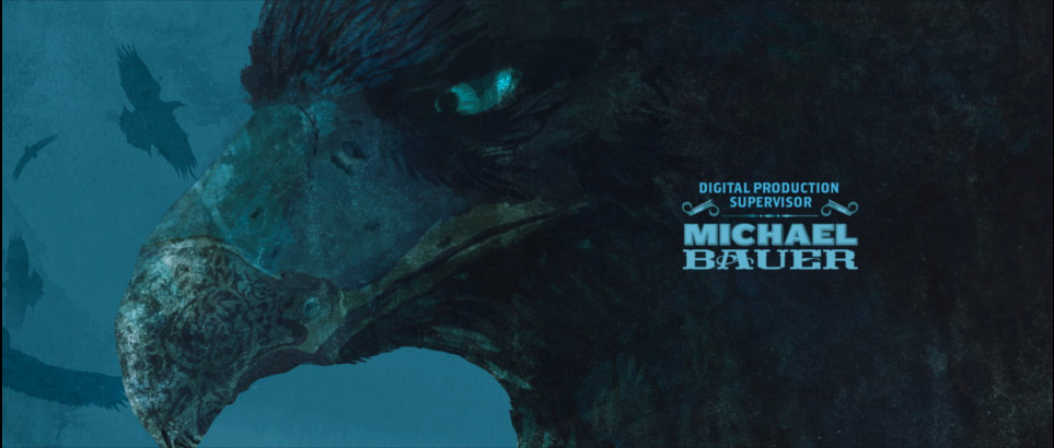
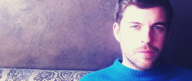
Henry Hobson
After graduating from the Royal College of Art in London, the UK-born designer and director Henry Hobson started working at Why Not Associates in London, doing everything from sculptural objects and designing postage stamps, to title design.
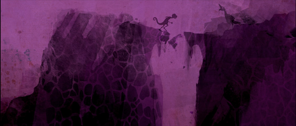
Process
“The ideas were born out of playing with some of the key story elements of the film, which is about finding water. And it’s about the relationships between the characters.”
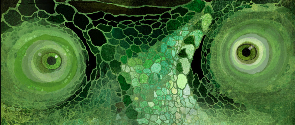
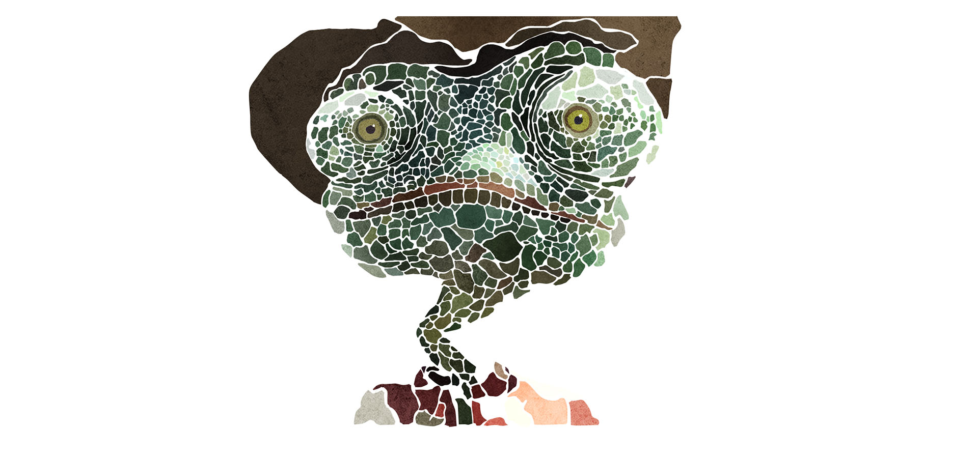
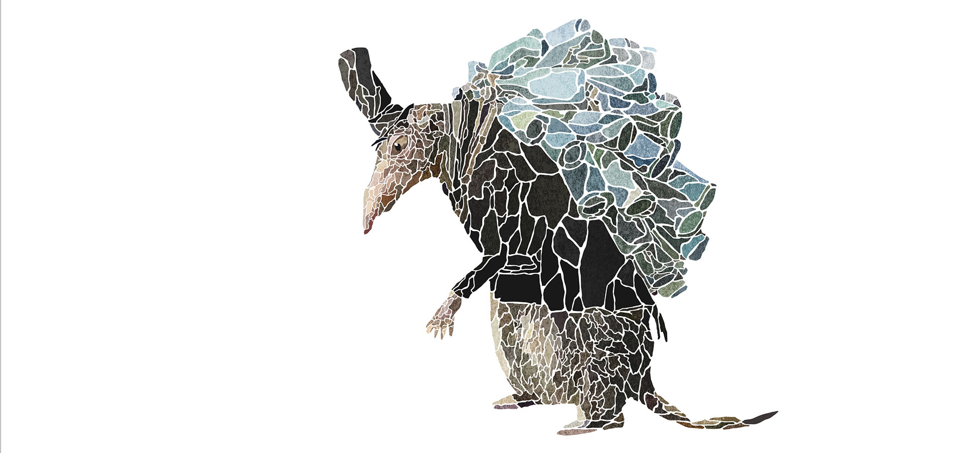
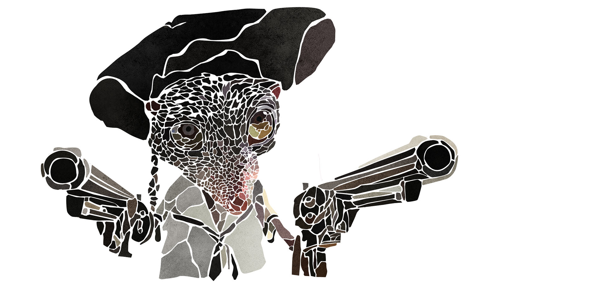
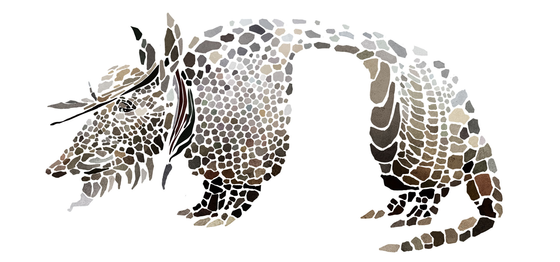
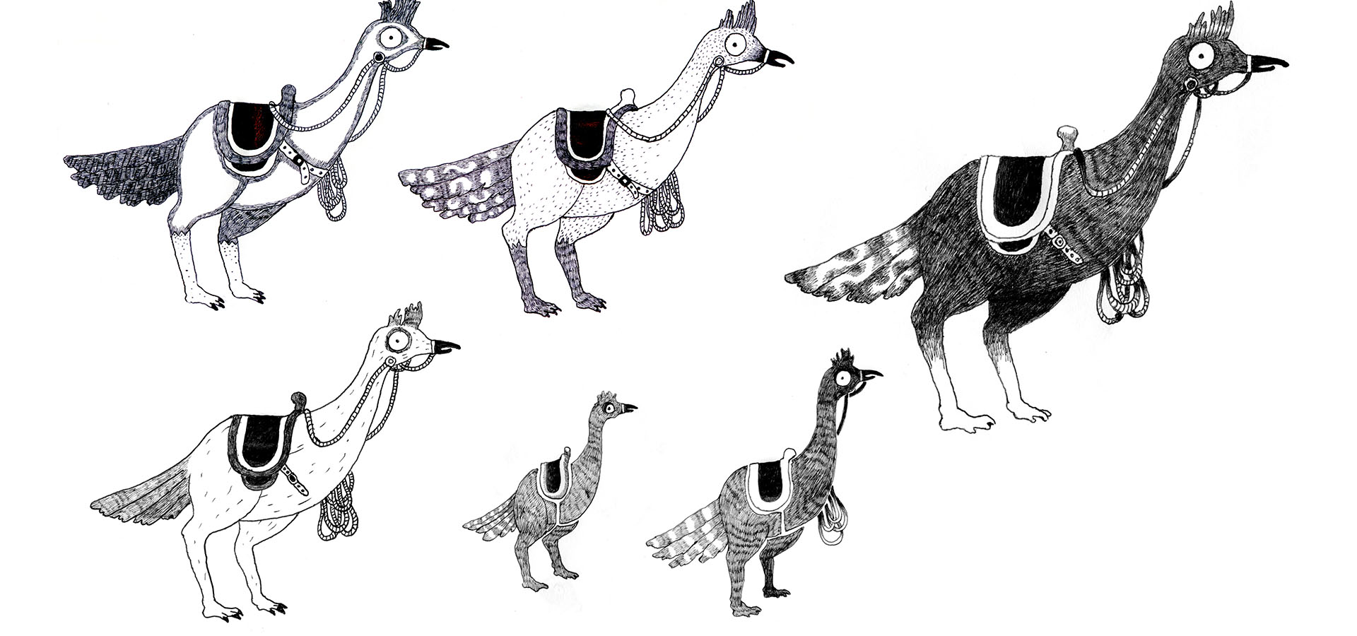
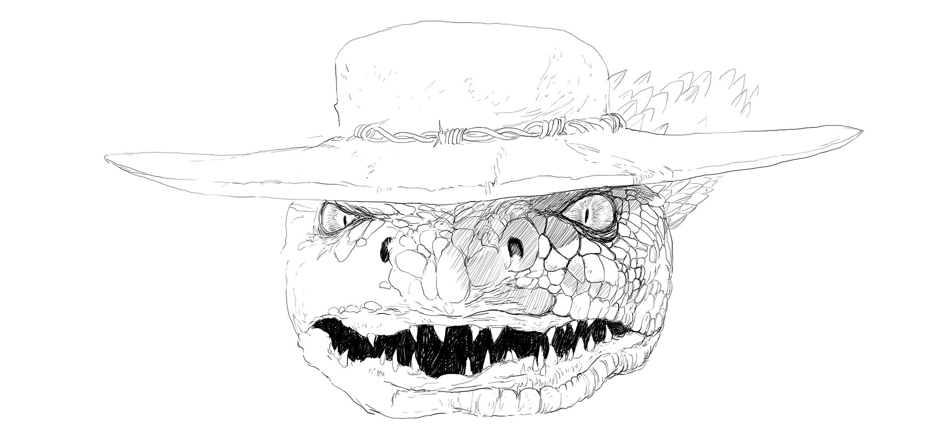
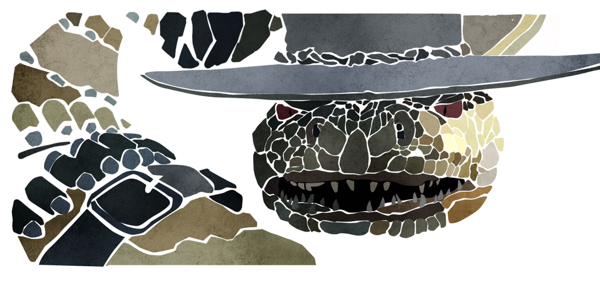
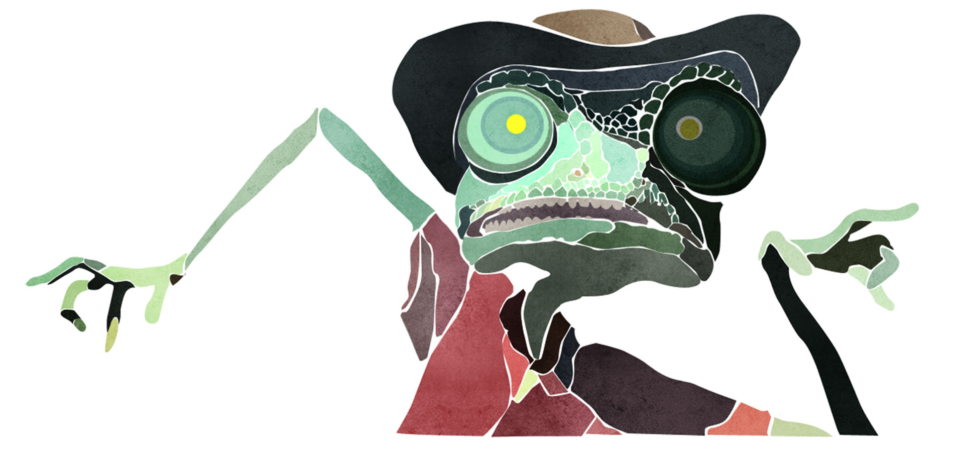
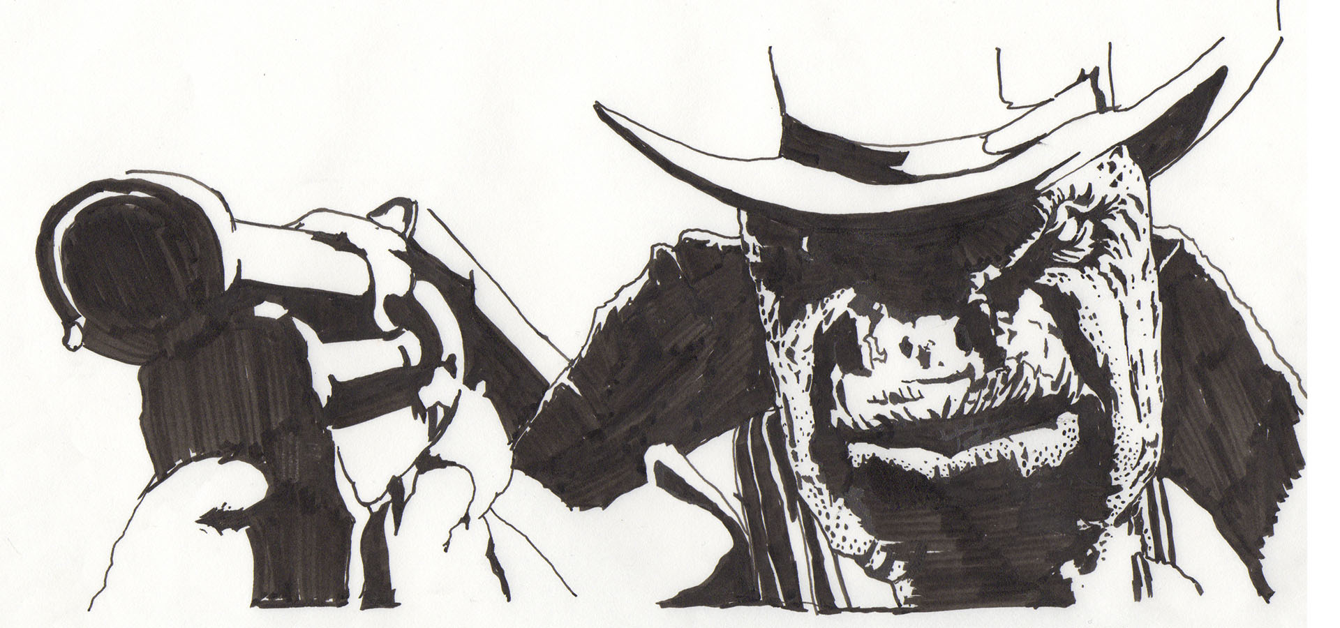
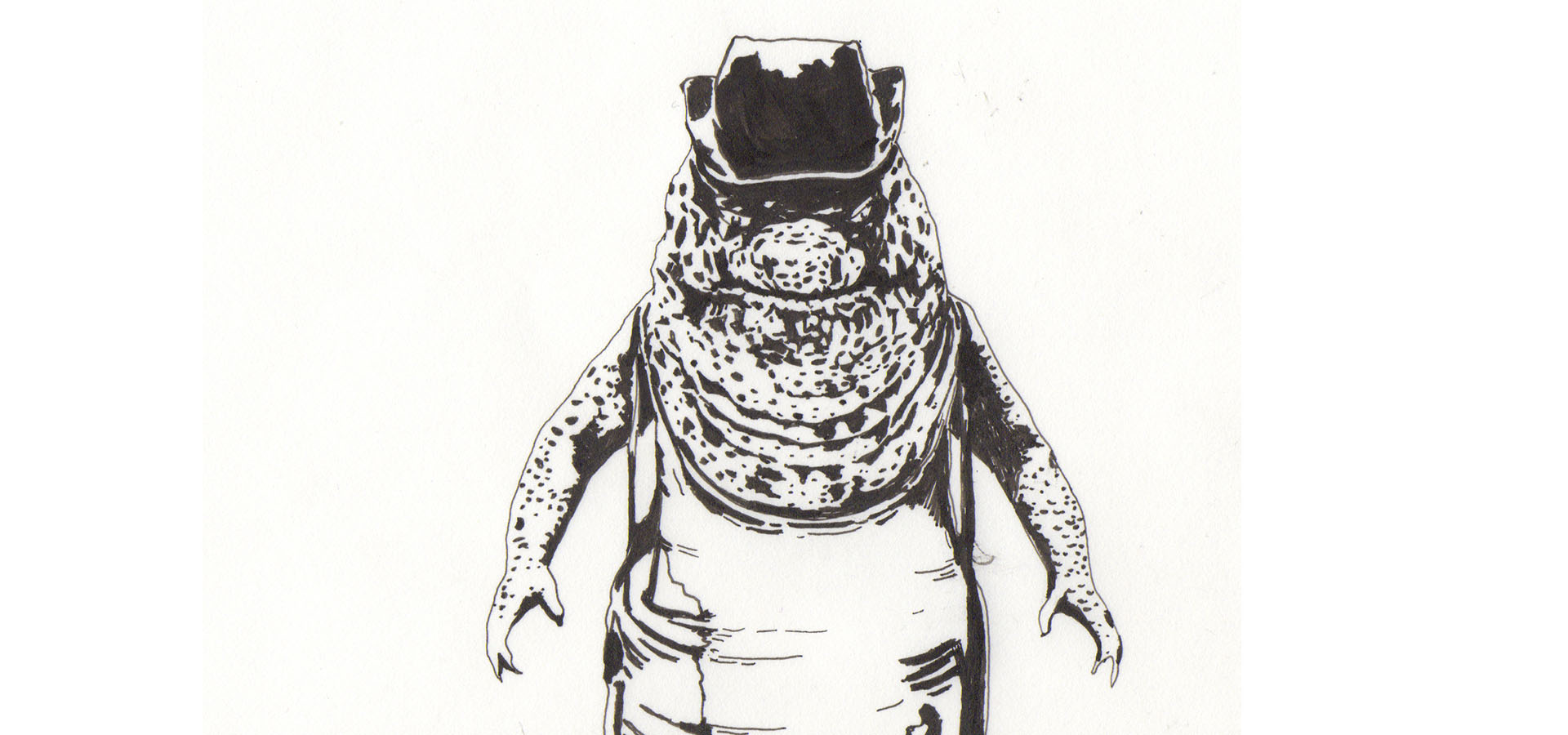
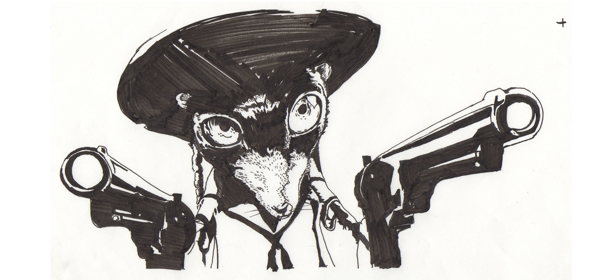
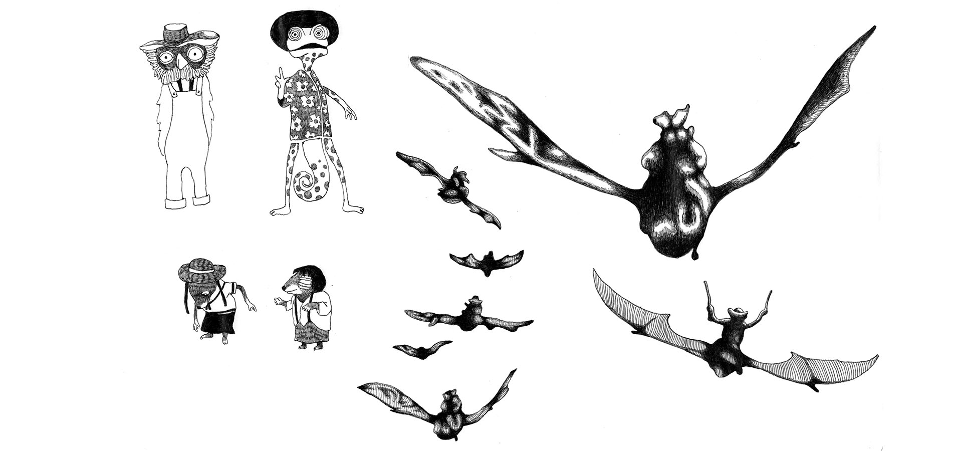
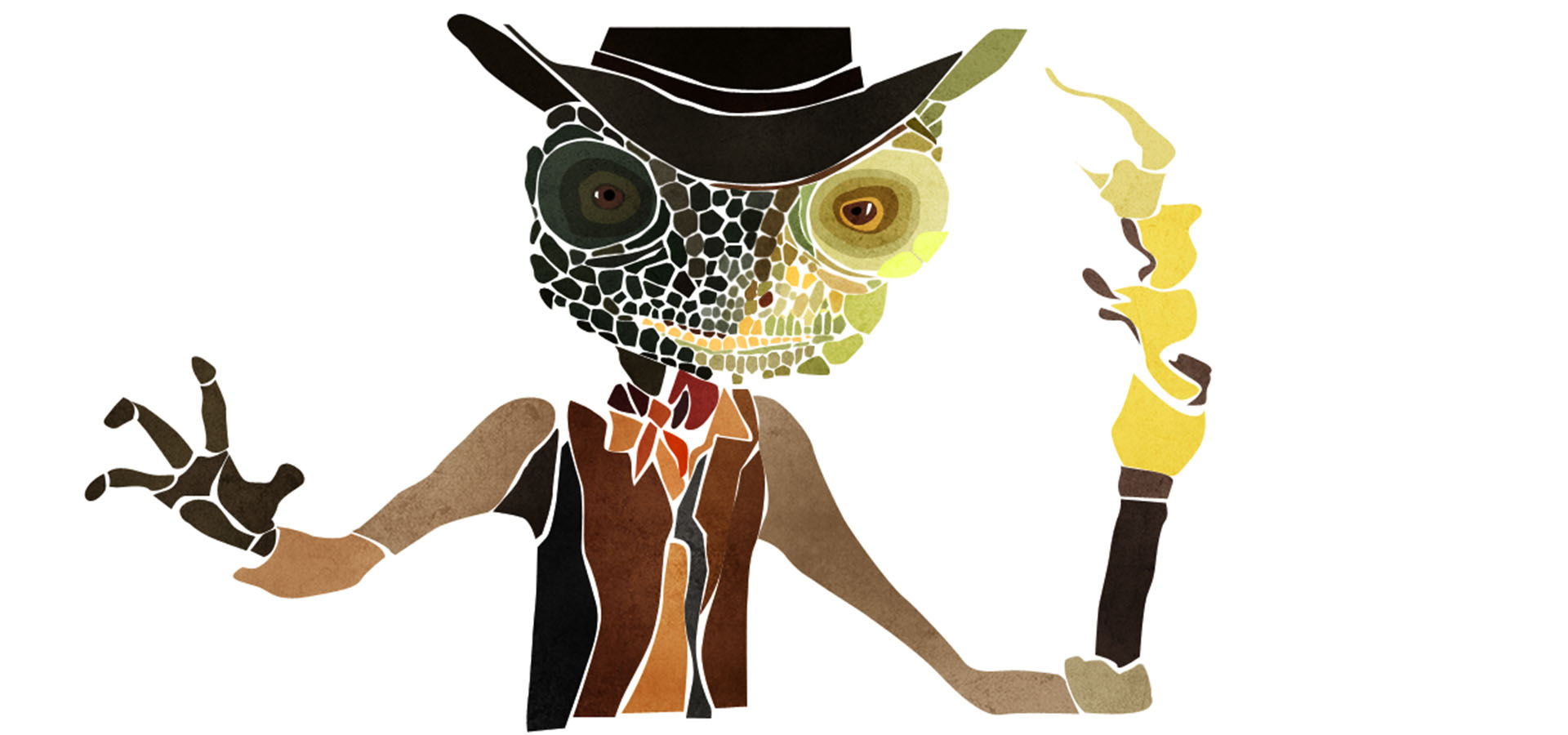
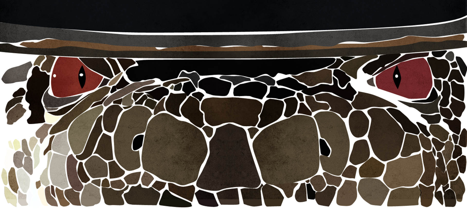
“They wanted something in the vain of [the title sequences of] RocknRolla, Sherlock Holmes, and Robin Hood… that kind of more painterly, more illustrative look. But we soon realized that what we had done up to that point didn’t feel like its own world. One of the first ideas had a nice aesthetic, which was to build each character out of scales, which gives it that quite characterful style.”
Illustrations
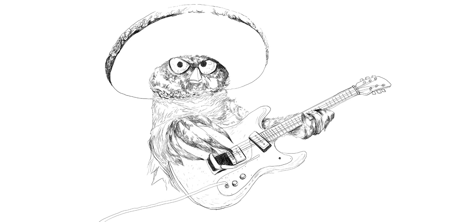
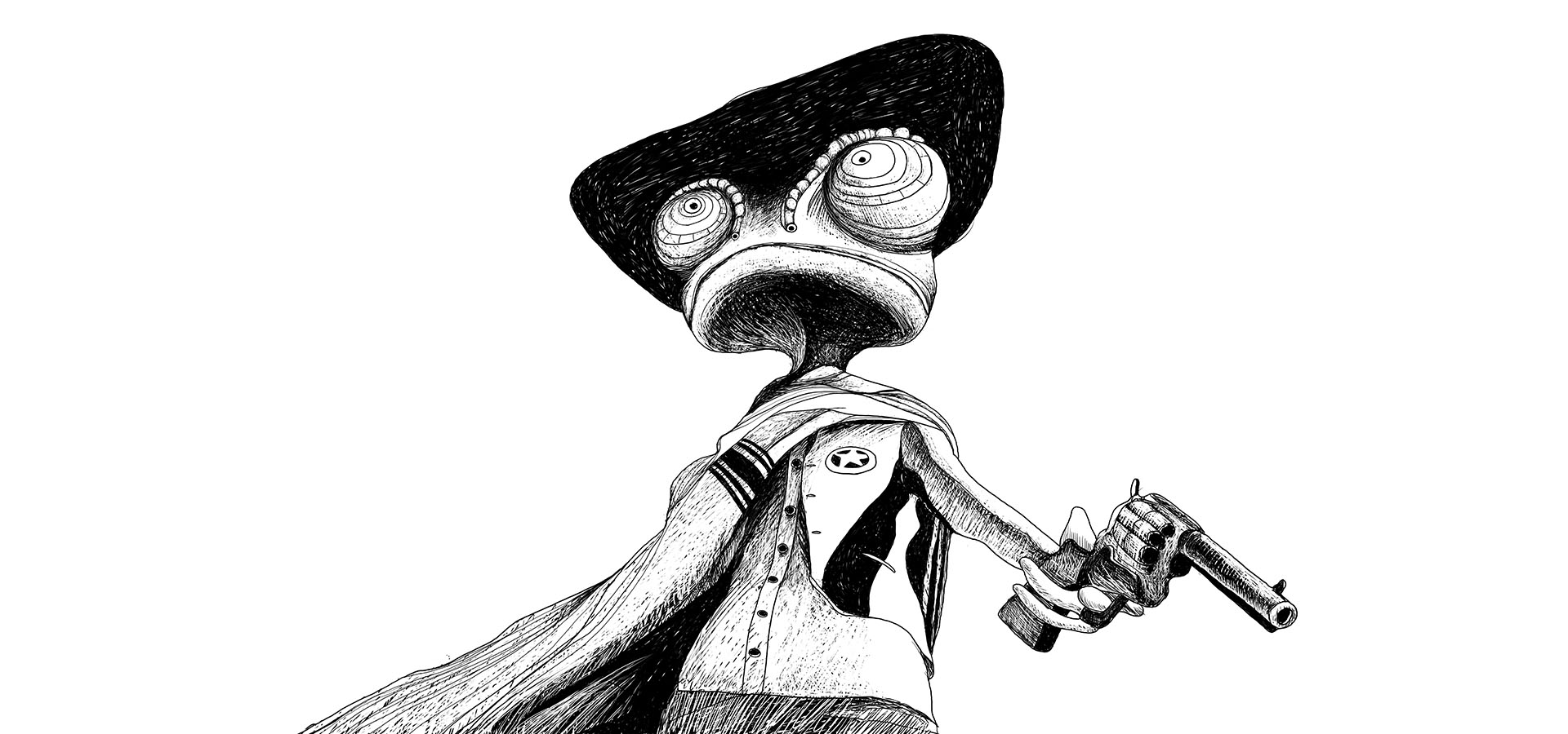
“At the very first stage, when I was blocking in the characters [deciding the positions and movements of the characters on the set], getting the colors and the palettes right, I used a more general illustration technique – pen and ink.”
There really is this rebellion against the fact that it’s so easy to do things digitally.
“As you can see from these boards and from the initial concepts, we didn’t really change the look of it too much. It started as it was meant to go on.”
Handmade things
“Lots of stuff is now handmade. I see lots of screen-printed T-shirts for example. I think people appreciate the energy and effort that was put into a handmade piece of work, and it starts to pay off. It’s just that extra level of attention to detail that handmade gives you that I think people are catching on to. Even when mediums die out, like film and polaroid, people will want to keep seeing these artistic and niche, analogue mediums.”
What’s the benifit of creating handmade artwork from a creative point of view?
“Creatively it allows for a more playful scope. It’s so much more refreshing to take your work area off the computer screen and onto paper or canvas, or even just playing around with photography, rather than limiting yourself to whatever inspiration comes up between those four corners of the digital screen.”
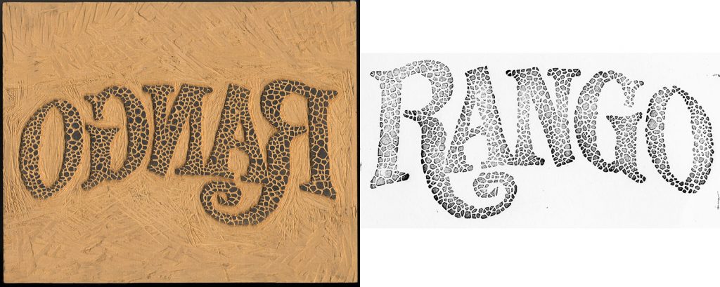
The woodcut technique
“Initially, the idea was to make all the credits as a woodcut, but time did allow for full experimentation with that. Prologue’s typographer, Manija Emran, worked at meticulously woodcutting the Rango logo and turning it into scales, which produced a really nice effect that we subtly meshed into the final project.”
Credits
Creative Direction, Design and Illustration
Henry Hobson / Prologue
Producer
Unjoo Lee Byars
Executive Producer
Kyle Cooper
Typographer
Manija Emran
Lead Animator
Alasdair J.T. Willson
Animators
Daniel Kim, JD Burditt, Jeiko Jongyoon Soh
Additional Animation
Daniel Kloëhn, Takayuki Sato, Gary Mau
Additional Illustration
Ji Y Ha, Eunha Choi, Vincent Masson
Character Animation
Erik Lee, Darren Sumich
Character Texturing and Lighting
Bekah Baek
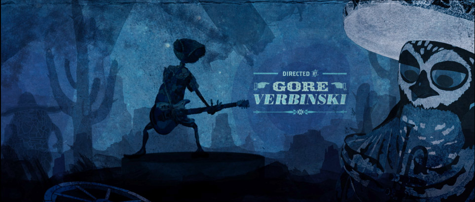
Director (film)
Gore Verbinski
Client
Blind Wink
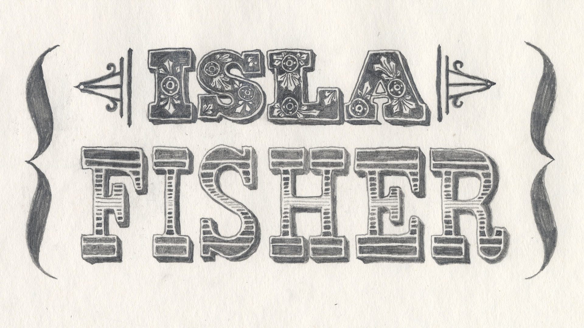
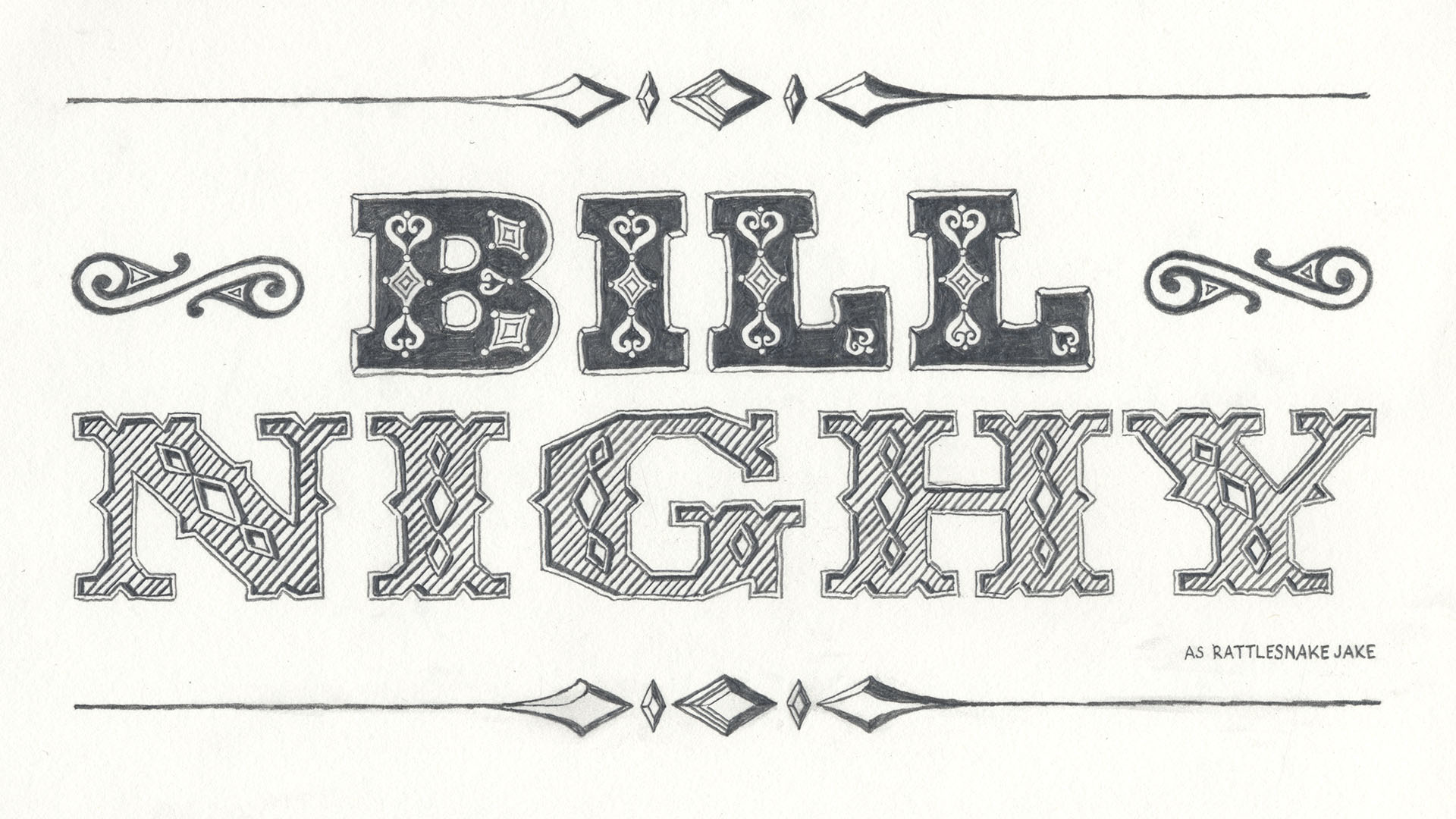
Typography
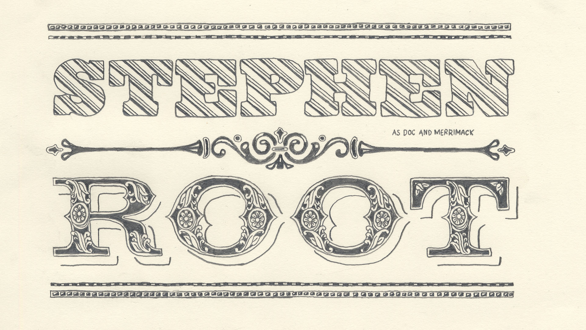
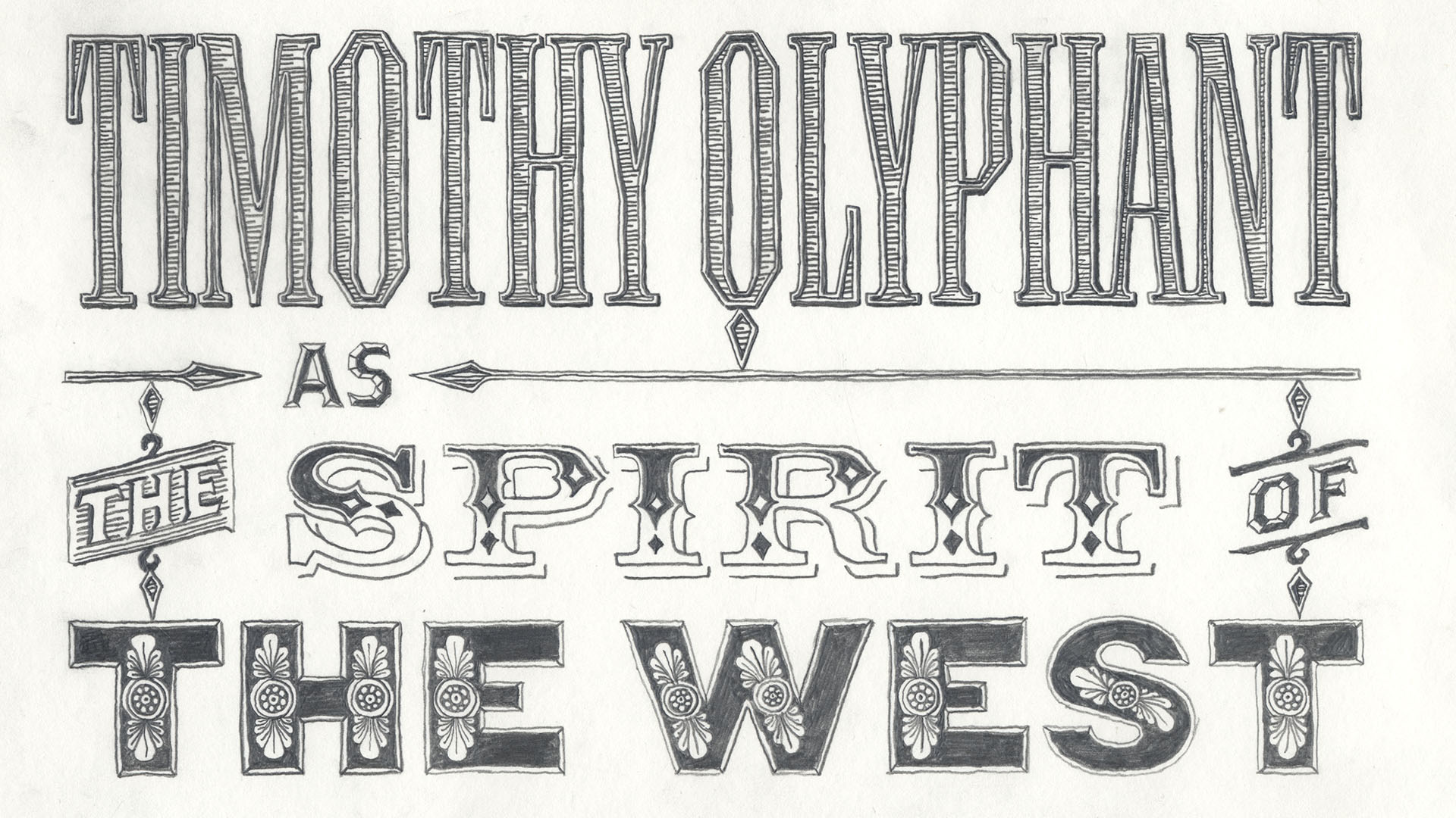
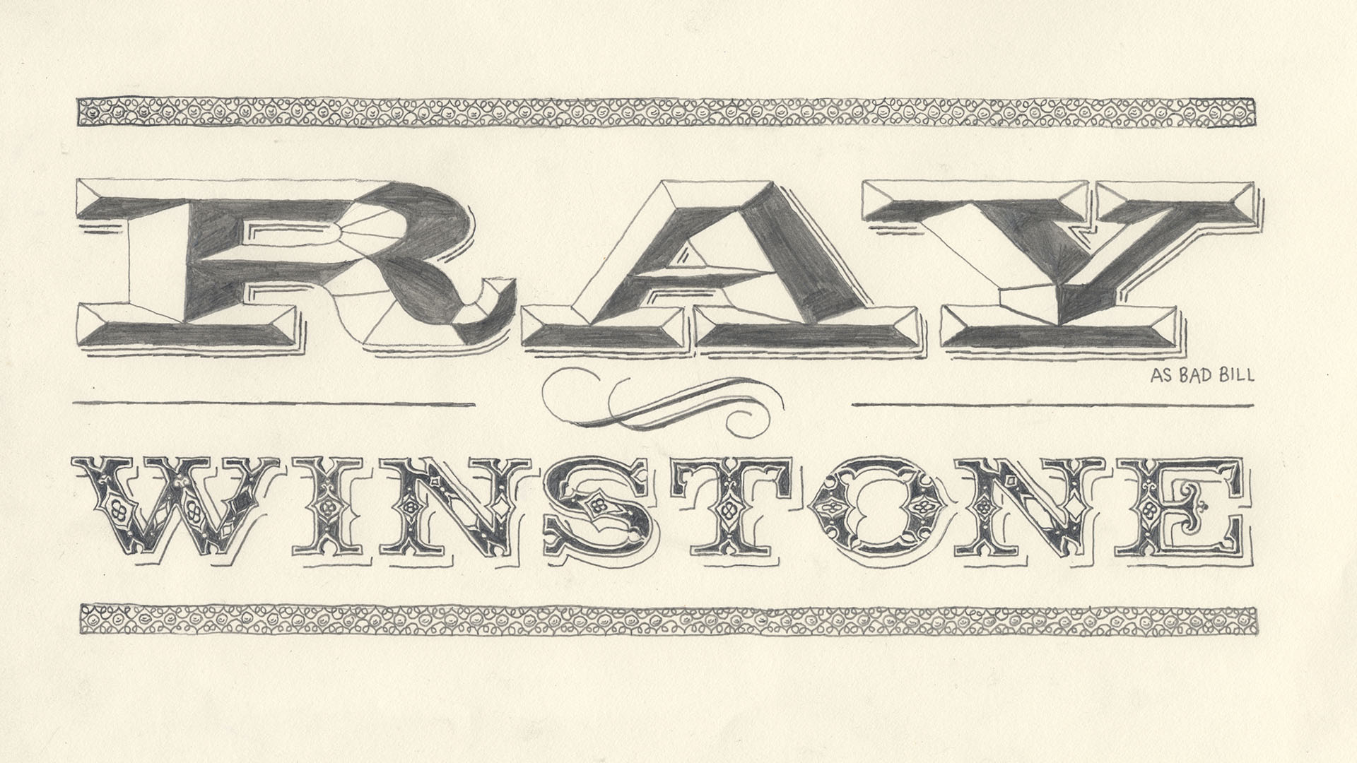
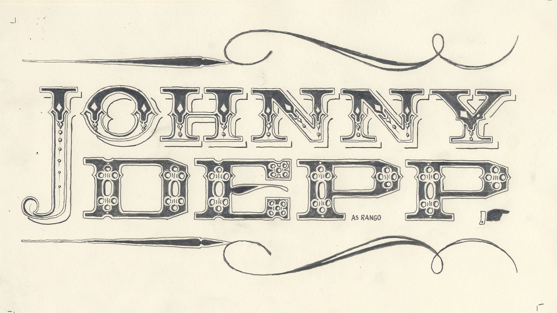
“The original idea with the pencil drawing typography was to have the characters interacting with the names. It was again Manija Emran, who meticulously hand-drew these amazing, Western-style, flourished blocks. They stand alone.
It was disappointing, but we had to shrink them down eventually. But there was a stage when the whole titles could have been these huge names full screen with characters interacting with them, falling off them, running across the tops, moving in and out of the names.”
Inpiration
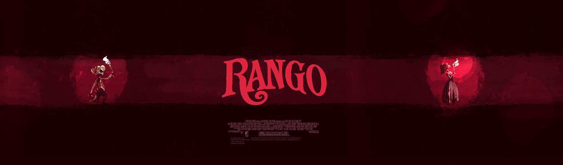
“We looked at The Good, The Bad and The Ugly. The boldness, the colorfulness and the playfulness of those titles were definitely an inspiration. Not just the titles but also the movies. We were looking at Sergio Leone’s camera work and cinematography to build our shots. That was the main intention, to create a fun ending with subtle references to old school Spaghetti Western films.“
“The Polish and Czech film posters were always amazingly done. And then you get the English version, which is always a photograph with a floating head. The people who designed those Polish and Czech posters probably had no idea what the film was about. With just a brief description they came up with these crazy designs. Nowadays, everything is slowly becoming more homogenized. Italian film posters look the same as the English ones and the German ones. Which is a bit annoying because I like different interpretations personally. And seeing how they come out.”
Transitions
“With some of the color changes from the original boards the client was very much like “Oh I like that. This is what I want to happen in the final product.” So one of the problems we had to overcome was fitting in these color changes.
“We wanted to keep the transitions as analogue as possible without us actually printing them out and stop-frame animating. Alasdair Wilson and his team of animators created these kind of painterly swashes to take us between the colors – something we used from past experience on jobs like Sherlock Holmes and built upon. And we used little tricks like lights going on and off and falling down holes, which allowed us to mask some of the color shifts. Alongside that, we used some of the scale textures as transitional textures. If you stop halfway through some of the scenes you’ll see half the screen’s taken up with a scale pattern.”
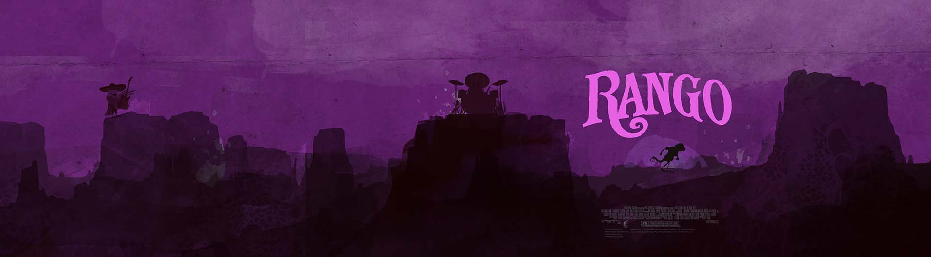
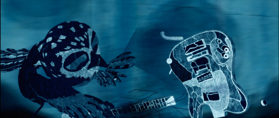
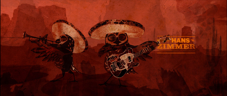
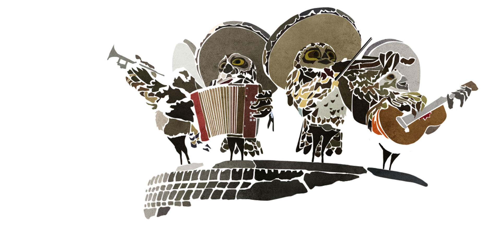
The Jimi Hendrix moment
“That came from the director, Gore Verbinski who’s a big rock music fan. I think he used to be in a punk band. In the movie there are these mariachis, these four owls that pop up periodically to tell you about the fate of Rango. Verbinski wanted these mariachis to put down their instruments and become a rock band.”
3D Animatic
“We had a lot of fun. Everyone in the office was pitching in all these memorable rock moments. You’ve got Hendrix burning the guitar. You’ve got The Who smashing the stage up. Someone sliding on their knees in a Springsteen kind of way. And there’s an homage to Dick Dale and the Del-Tones.”
“If you watch the original recording of the Dick Dale song from Pulp Fiction, you’ll see that we matched the same guitar moves with the guys rocking out on the surf guitar. There was even an earlier version which had an homage to This Is Spinal Tap. We had a mini-Stonehenge dropping behind one of the characters. I’m originally from England, from very near Stonehenge, so that was a reference I wanted to bring in for myself. But not enough people had seen the Spinal Tap movie to get it.”
end crawl