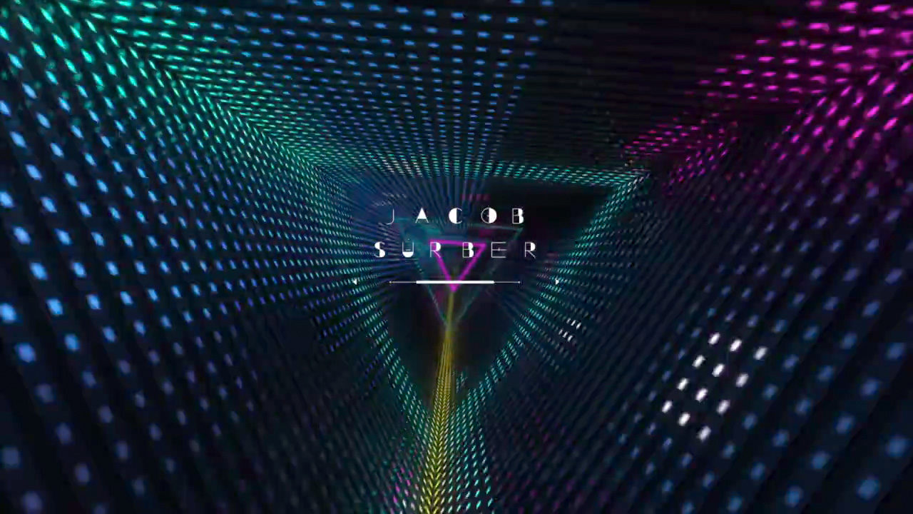
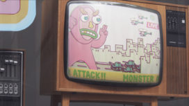
With an Enter-the-Void-esque design and concept artwork created by GMUNK, Dutch design studio Onesize took a decidedly straight-forward approach to designing the main titles for the 2013 edition of the design and technology conference FITC 2013, which took place on our home turf in Amsterdam. Onesize took the opportunity to do something they’ve never done before, “a flashy house tunnel sync’ed to a phat custom dance track.” Mission accomplished!
We were privy to watching them debut on the big screen, and following the event we chatted up Rogier Hendriks of Onesize to find out more about this seamless collaboration. So sit back for this one. Your head may spin, but don’t you dare blink.
720.jpg "FITC Amsterdam 2013 (stills)")
THE CONCEPT: A COHESIVE LOOK
Working off all of the killer print campaign assets already designed for FITC Amsterdam by graphic and motion design extraordinaire Bradley Munkowitz, otherwise known as GMUNK or Munko, Onesize liked his work so much they avoided creating something completely new and instead “built on Bradley’s concept and artwork, so every part of the overall visual communication would form a consistent whole”. Rogier explains that “the FITC titles finally gave us the opportunity to do a project together, and it was only natural –and an honor– to take his work and use it as the basis for our title sequence. In this way our work was a literal collaboration, with titles that complemented the work of Bradley.” The combined effort of MassiveMusic, who composed the custom track with added sound effects, with the flawless execution by Onesize truly elevated GMUNK’s work. An extended version of Massive’s track will be released soon.
THE VISUALS
Sharing is caring, and GMUNK, who refers to himself as Munko, has kindly put together a whole text and process video explaining his inspiration and build of the Pyrad that created the simple pixel animations and later served as the main visual across the print campaigns and generated the title sequence.
FITC Amsterdam 2013 PYRADICAL from GMUNK on Vimeo.
PYRAD INSPIRATION/COLLABORATION
On his website, Gmunk explains how the “DMT-delicious moments” from his “super-favorite film” Enter the Void (watch the titles) inspired him. He wanted to build a “practical, LED installation driven by graphic sequencing, utilizing the techniques learned from the FOTB Titles and applying them into a more densely packed setup called the Pyradical. Once the Pyrad was constructed, the aim was to capture the visuals with both high-resolution Film and Still cameras, which would generate a vast library of content to pull from to produce the artwork for the Conference Package.”
Lighting expert Michael Fullman helped construct a “triangular volume out of three LED panels, flanked on either end by a trio of light tubes that would complete the design.”
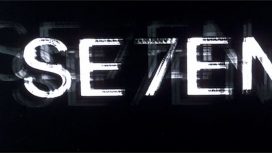
TYPOGRAPHY

Gmunk: “One of the most important aspects of the conference package was the typographic Language. (…) The typography was all based on the lovely YouWorkForThem font called Sevigne, which Brian M Gosset, and his talented wingman Gera Frascaroli altered to perfection…”
01.jpg "FITC 2013 Typography")
posterbyGmunk.jpg "FITC 2013 Poster by Gmunk")
STORY? WHAT STORY?
While it’s become routine for audiences to sit back and expect narrative-filled event titles that tell ‘a story’, Rogier explains that Onesize chose to keep it simple – read: not dull – and deliver “a cohesive visual package to FITC”. “To be honest, we were kind of fed up with all these event titles with a vague storyline and ultra-high-end designs which are becoming sort of commonplace now.”
“With all due respect to the creators of those titles (referring to titles for OFFF by The Mill and PostPanic, and the recent OFFF Cincinnati titles by Onur Senturk) these productions are visually stunning and inspiring, but at the same time quite empty, pretentious, and repetitive, whereas I think that event titles offer the perfect opportunity to experiment and go for the unexpected, step outside your comfort zone as a designer, or just to tell a beautiful story.”
While at first it may seem like a simple design, I can’t help but bob my head and get into a whole sitting down dance-routine watching this sequence. There’s something so pure but epic about this eye-candy design with a seriously dope music track. Which brings up the question: does there need to be a narrative every time with titles for events? No, but the feeling is great, and you get a feeling when watching this. What more can we, the audience, really ask for?
.jpg "FITC 2013 titles (stills)")
“FREE” VISUAL EFFECTS
One can’t help but conjure up conflicting feelings for the high production value yet pro-bono event title sequences we’ve come to anticipate at a range of design events at a time when the visual effects community is gearing for a shake up. Indeed, all signs point to a VFX revolution upon us, spurred by crippling challenges facing the VFX community, where the system squeezes employees, unpaid overtime abounds, and fast and cheap RULE. We sure hope that huge changes are ahead. But what can then be said about these title sequences, commissioned by organizers, produced, usually, completely free of charge, and enjoyed in the first row for a ‘nickel and dime’?
No doubt, the whole VFX discussion triggers a lot of thoughts for both us and Onesize, and that’s a story for another time. But regarding the event titles, Rogier comments that “ titles would have to stay pro-bono and not be commercialized, to ensure that the creators will always have complete creative freedom, without some kind of creative-commercial supervisor looking over your shoulders or interfering with the authenticity of such creations.”

Article: Katy Yudin, © Submarine Channel 19 March 2013.
Year of production
2013
About GMUNK
Bradley G Munkowitz – most commonly known as GMUNK – is a freelance design director for the motion graphic industry who is also passionately involved in the global design community. His work covers a range of immersive interactive web experiences and digital effects for both the screen (most recently, holographic content for TRON legacy) and physical space.
Full credits
Design & Concept: GMUNK
Production & Direction: Onesize
Type Font Design: Brian M Gosset
Music & Sound Design: MassiveMusic