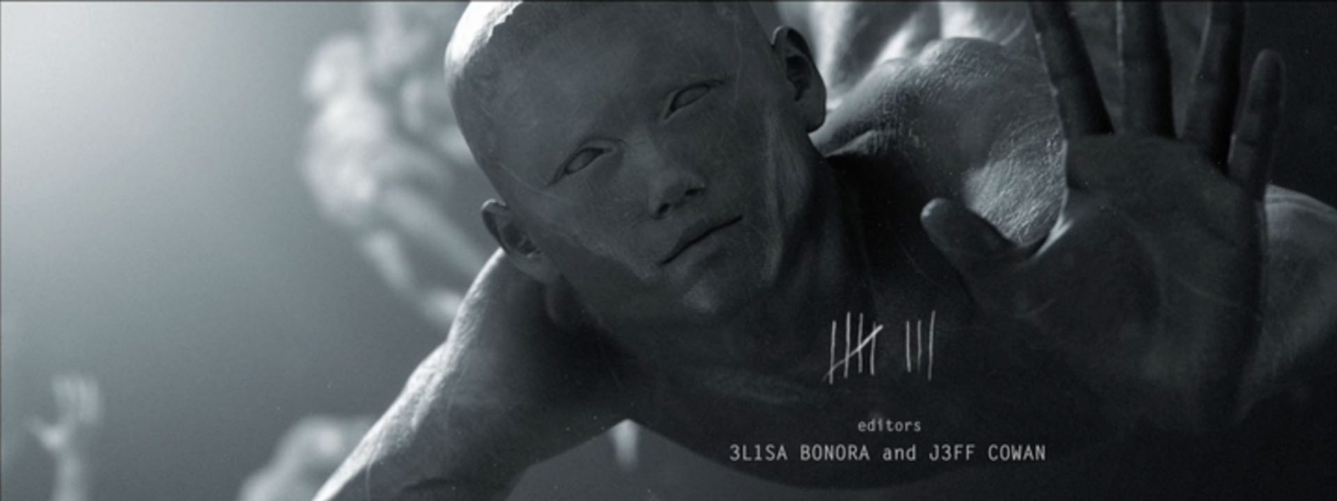
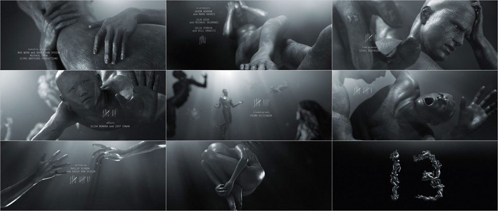
“A writhing mass of bodies trying to escape from the never-ending ether,” says Rob Rugan, creative director of Superfad, about the concept behind the main title for ’13’. This is the first main title created for a web series that really made an impression on us.
Recently we’ve seen a number of interesting title sequences created for festivals, events (AICP Show) and games (Killzone 2). Now it seems that the web is emerging as an another alternative platform for high quality title design. Now that Hollywood mostly prefers to stick title sequences at the end of the movie title designers are embracing the possibilities and challenges of these new arena’s. An indication of a promising future for title design beyond the movies?
’13’ is an online interactive drama horror series by Paramount which premiered exclusively on MySpace on October 27, 2009, albeit under the new title ‘Circle of Eight’. Another show showed up called ’13’, so the title was change. “Some of the elements of the ’13’ title sequence were used in the new title sequence,” Rugan says, “and we did work with producer/director David van Eyssen to design the new main title logo.”
Superfad had worked with David Van Eyssen previously on the Terrorvision Film series. Rugan: “The initial brief for ’13’ went something like this: “There are thirteen people trapped in an old hotel and they are being killed off one at a time. So everyone is a potential suspect, everyone is a potential victim.” And David really liked the idea that these were trapped souls – thirteen trapped souls.”
“The concept for these titles came from Rodin’s ‘Gates of Hell’. We all really liked the idea of this writhing mass of bodies trying to escape, but instead of them being trapped in bronze or stone or something solid, we chose to put them in the never-ending ether. There is no up or down or left or right. It’s nothing. It’s very bleak now that I think about it. Haha.”
“A good bit of the style came from looking at those classical sculptures – Rodin’s ‘Gates of Hell’, Giambologna’s ‘Rape of the Sabine Women’, etcetera. Taking those tense, labored poses and combining that with the look and feel of underwater photography. It was Rodin underwater to oversimplify it. The choice to go black and white or almost completely black and white (there is a hint of blue to cool it off a little) with the 3D came from us looking at the contrast of those early sculptures. We liked the black and white, light and shadow, good and evil contrast.”
“Each of the characters depicted referenced a character from the show. There was the aging movie starlet, the Asian male twenty-something, the burly bald bouncer, the young boy, the two rival actresses… They didn’t look exactly like the actors, which was done on purpose. We wanted them to be the archetypes of the characters. We were pleased with how those turned out. They are specific to the characters, but also retain that generic look that was typical of those classical sculptures.”
The characters may look like they’re based on real people, but Rugan says they didn’t use motion capture. “All the animation was hand-animated. It needed to feel tense. Every character had to feel on the edge – falling, reaching, drifting, fetal – so we chose to show short tense moments.”
Is there’s any difference in creating a main title for an online show as opposed to creating a title for a tv show or a movie?
Rugan: “Other than technical differences, not really. The main difference was that the final product was going to be compressed pretty heavily and shown at different sizes. So although we were in this really wide format, we had to make sure the titles were large enough to read after being compressed. Our initial tendency was to go smaller with the titles because we liked the scale difference between the large bodies and the smaller typography, but we had to change all of that when we did compression tests. We recomposed shots, reworked some of the placement of the type, and made it more functional for online. But as far as how you approach the creative concept – no. Not really different. You are still telling a story without telling THE story. It’s very much about distilling the essence of the series/film down to a few quick strokes.”
Article: Remco Vlaanderen, © Submarine Channel, 10 December 2009. Last update: 15 November 2019.
Year of production
2009
About Superfad
Superfad is a brand-driven design and live action production company with offices in Los Angeles, New York, Seattle and London. Superfad is a collective made up of designers, directors, animators, and artists.
Full credits
Title sequence
Superfad
Creative director
Rob Rugan
Producer
Christina Roldan
CG Supervisor
Michael Wharton
CG Animators
Bill Burg, Angel Negron
Lighting/Materials
Mike Wharton, Bill Burg
Compositor
Daniel Pernikoff
Executive Producer
Geraint Owen
Music
Unkle – “Price You Pay”
Film director
David van Eyssen
Links
Circle of 8The web series on MySpace. Only available to a US audiences, for now.
SuperfadOfficial trailer
Circle of 8 trailer on YouTube

