
Hello,
A lot of inspiring new content in the pipeline for 2013 here at Watch the Titles. New articles and features, of course. New video interviews and artist profiles are being edited as we speak. And we’re working on a new series of Watch the Titles spin off projects in the real world. Last but not least, a new website (tips for designers, anyone?). We usually do popularity contests, but as we prep for a no doubt exciting year for title design, it’s nice to see which ones topped the proverbial charts in 2012 here at Watch the Titles.
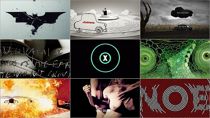
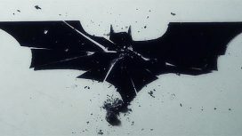
1. The Dark Knight Rises (2012)
logo.jpg "The Dark Knight Rises (still)")
Most viewed and most discussed title sequence in 2012 is the unofficial title sequence for The Dark Knight Rises, made by Turkish student of Communication Design Doğan Can Gündoğdu. Smart move by Dogan to release the title sequence months before 2012 most anticipated movie’s official premiere in July. The net result? A lot of exposure for this young designer. And even better, several high profile commissioned jobs and Dogan is now signed to Partizan as an animation director.
2. xXx State of the Union (2005)
01.jpg "xXx - State Of The Union (still)")
A surprising second place for a 2005 title sequence by veteran title designer Bruce Schluter, who co-founded the innovative 1980s title design company Greenberg/Schluter together with Richard Greenberg. xXx was Schluter’s first job at Pacific Title & Art Studio. In 2011, this 90-year old title design company had to file for bankrupcy, which could explain the increase in pageviews for this testosterone-fuelled title sequence that features tanks, guns, fire, explosions, and the American flag.
3. X-Men First Class (2011)
-WatchtheTitles.com.jpg "X-Men: First Class (still)")
You appreciated our feature about the Binder and Bass-inspired title sequence for X-Men: First Class. Prologue designer Simon Clowes created a clean, simple and elegant title sequence that perfectly reflects the new artistic direction of the X-Men movie frenchize. Clowe’s titles deservedly won the Silver Art Directors Club Award 2012 in the Motion category, and Special Jury Recognition at the SXSW Excellence in Title Design Awards 2012.
4. Lemony Snicket’s A Series of Unfortunate Events (2004)
")
Jamie Caliri’s epic animated end title sequence for Lemony Snicket’s is short film in its own right. It’s been in our top 5 most viewed titles every consecutive year since we launched this website back in 2006 (has it really been that long?). I must have seen it dozens of times, but I never get tired of it.
5. Le Petit Nicolas (2009)
.jpg "Le Petit Nicolas (still)")
Lovely title sequence by two masters of French title design, Kuntzel & Deygas. Everyone knows the designer duo from their seminal title sequence for Spielberg’s Catch Me If You Can. For Le Petit Nicolas, they brought to life in a pop-up book style the famous original drawings by French cartoonist Jean-Jacques Sempé to project a nostalgic 1950s aesthetic. Nicolas wins “most liked on Facebook” too.
6. Se7en (1995)
Casting.jpg "Se7en (still)")
We’ve written, talked about, and featured this title sequence so many times and in so many different contexts, yet there is still so much more to say because this title sequence is an enigma. So is its creator, Imaginary Forces and Prologue founder Kyle Cooper. I’m guessing that half the title designers we interviewed mentioned the Se7en titles as a major influence. We updated our article about this title design evergreen in 2012 with new insights, stills of the subbliminal imagery, and quotes by experts.
7. Snow White And The Huntmen (2012)
sword.jpg "Snow White and the Huntsman (still)")
“Darkest end credit sequence we ever featured” I wrote when we featured “Snow White.” This is the last title sequence created by Henry Hobson, who is currently focusing on his carreer as a live action director and is working on two feature films. After Hobson’s inspiring presentation in Amsterdam at our PlaySub event in November, we shot a video interview with him backstage. Expect see that online in March.
8. True Blood (2008)
")
Quite a surprise to see Digital Kitchen’s True Blood titles from 2008 in this top 10. With HBO’s stylish vampire show going into its sixth season this year, we figured everyone must have seen the titles by now. As influential as the True Blood titles may be – spawning a whole series of rather medoicre imitations since 2008 – we need to consider that the striking similarities between the True Blood titles and the 2003 doc Searching For The Wrong-Eyed Jesus. My point is that this beautiful film has never been credited as a source of inspiration for the designers, who were nominated for an Emmy for their titles.
9. Rango (2011)
.jpg "Rango (still)")
Popular fellow Henry Hobson’s second entry in this list! The Rango post is one of our favorites too because of all the amazing handmade process that Hobson was able to share with us, courtesy of Prologue. The storyboards, the illustration art, and especially Manija Emran’s handdrewn Western-style typography are just as interesting as the final title sequence.
10. Enter the Void (2011)
.jpg "Enter the Void (still)")
So pleased that Enter the Void made the top 10 most viewed. This is such an exciting and provocative (‘bad’ typography but done in a great way) title sequence and it’s one of my top personal favorites. Whenever I am asked to give a talk about the Watch the Titles project I show these titles, because to me they exemplify that title design is indeed a unique interdisciplinary time-based art form. So kudos to French director Gaspar Noe who keeps innovating “the language of cinema” through bold experiments with POV, ‘bad’ typography, and controversial stories. If you ever get the chance to see these titles in a cinema, do it! It makes all the difference.
Article: Remco Vlaanderen, © Submarine Channel 24 January 2012
Year of production
2012
Full credits
Thanks to our audience for their continued support for this website!