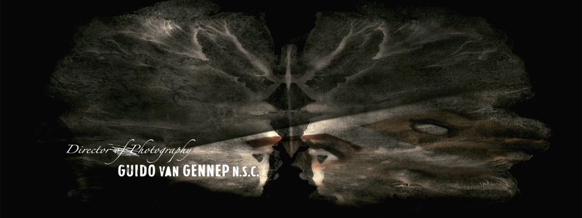
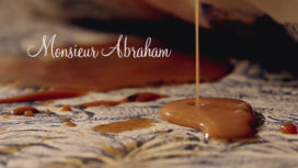
Zwart Water (Two Eyes Staring) is arguably the first Dutch psychological horror movie in the genre of Japanese movies and their American remakes like Ring (The Ring) and Juon: The Grudge – a rare genre in Dutch cinema. Self-taught filmmaker and motion designer Djie Han Thung created a simple, atmospheric title sequence that combines Rorschach ink blots and live action footage to reflect the psychological state-of-mind of the main character.
The movie tells the story about a young family that moves into the mother’s old family mansion in the Belgium countryside, the nine-year-old daughter, Lisa, befriends a sinister girl who lives in the basement. The girl says she’s the ghost of her mother’s dead twin. Slowly but surely, dark secrets from the mother’s past begin to surface, with deadly consequences.
The director, Elbert van Strien, asked Thung to create a title sequence around the central idea of Rorschach shapes, as this reflects the central theme of perception.
“Certain events that took place in the past, the doubling of characters and how the main characters in the movie interpret these events are important elements of the story,” says Thung.
“For the title sequence, I wanted to create dreamy, decaying images that kind of open up into these Rorschach shapes. The main idea was to use innocent looking images to evoke a sense of threat that foreshadows the atmosphere of the movie. The Rorschach images, which were originally used in psychological tests, also point to the psychological state-of-mind of the father and daugther.
“The title sequence consists of just two layers, really: the live action images and the layer with the animated Rorschachs. I made a lot of Rorschach ink blots and scanned those. For every shot I looked for just the right shape and size.
“For the live action scenes, I worked with cameraman Jasper Bazuin. The shots with the girls were done during the film shoot on location. The close-ups were done in a small studio.
“The typography was done by Marc Fabels, who’s a far better typographer than me. We experimented with different fonts, but it turned out that a solid sans-serif worked best. We liked the combination of the clean sans-serif font and the handwritten-style font, but we aimed for a more ‘decayed’ look. We wanted the typography to be static and readable, to focus the attention on the images.”
The Netherlands have a good reputation when it comes to graphic design and typography. Then why is it that there aren’t that many interesting title sequences being designed in Holland?
Thung: “I don’t think they even give much consideration to title design in The Netherlands. It’s the last thing they want to spend money on, so there’s not much of a budget for it, if any. That’s why there aren’t so many interesting ones. But I hope that will change, now that more people are involved in motion graphics.”
Djie Han Thung is currently working on a short psychological sci-fi movie. “Another movie genre that’s not practised much in Holland, because people think it can’t be done here,” Thung says. “But we’re currently in post-production and I think it’s going to be very special.”
Year of production
2010
About Djie Han Thung
Djie Han Thung is a self-taught filmmaker. After art school he practised painting and graphic arts, played in bands, worked in a record store and as a tour manager. With cameraman Jacques Laureijs, who he met in art school, he made his first short ‘De Som der Delen’ (The Sum of Parts). He has since made several shorts, commercials, music video’s, title sequences and animations.
Full credits
Film director
Elbert van Strien
Title Designer
Djie Han Thung
Typography
Marc Fabels
Camera
Jasper Bazuin