
THE POWER OF DARK IMAGES
Turn your lights down low, and turn your volume up high because the end credit sequence of Snow White and the Huntsman is, by far, the darkest end credit sequence we ever featured on Watch the Titles. Combining high-speed phantom footage, elements from the film, CGI, and a custom designed font, The Mill L.A. created an intensely dark and truly gothic sequence that submerges the viewer in the mythical battle between good and evil. Watch the Titles talked to Creative Director Henry Hobson (Rango) about the power of dark images.
720.jpg "Snow White and the Huntsman")
Disney’s “Snow White and the Seven Dwarfs” was the first movie I ever saw in the cinemas and it made a big impact. I asked Hobson if he has any personal memories of the story of Snow White.
“Indeed, between the terror of Snow White and Bambi my childhood was forever traumatized,” kids Hobson, who recalls the powerful images of Disney’s evil queen, and the forest with its creeping knurled branches. The 21st century update of the age-old tale “channels a lot of darkness,” according to Hobson. “There are some really classically scary moments that retain that childlike fear factor.”
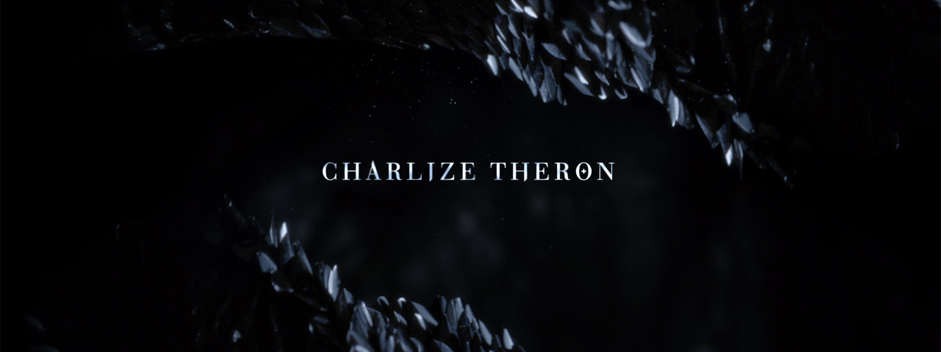
charlize.jpg "Snow White and the Huntsman (still)")
Production
The Mill [Mill Film London] had been doing work on the Mirror Man –the personal seer of The Queen– and on other visual effects (VFX) within the movie itself. But the company had never done a major movie title sequence from start to finish. When they were offered the titles, The Mill invited Henry Hobson to collaborate with The Mill’s Creative Director Andrew Proctor and his team on the sequence. Hobson, who has built a solid reputation as a title designer based on his work for movies such as Rango and Robin Hood, says this project was “just too good to pass up.”
There were phletora of early ideas for the credit sequence, recalls Hobson, “From medieval animated worlds, a journey through ice and snow, with nature being overrun by icy folds and creeping cold, blood in snow and book-like painterly travels.” But the best concept was an idea that focused strongly on the fight between light and dark, with bold typography.
“After Rupert Sanders, the Director, saw the power of those dark images, he wanted to just stick solely in that world. Almost complete darkness, punctuated by fire and fighting.”
fabric.jpg "Snow White and the Huntsman (still)")
fabric2.jpg "Snow White and the Huntsman (still)")
The almost abstract imagery hold a magnifying glass to the details of the characters and the intricate details from Coleen Atwood‘s costume designs that were so integral to the look of the film. Combined with a realistic high-speed sequence of an authorial battle scene, thte titles emphasize the epic battle between good and evil.
shatter.jpg "Snow White and the Huntsman (still)")
From a VFX standpoint, the greatest challenge was to create a high speed macro shot of the ‘shattering‘ of the dark knights into shards of obsidian. Instead of months, the design team pulled it off with a macro level of detail in a 10th of the time.
Phantom Raven
The creative team used the phantom camera –an ultra-high-speed digital video camera– to explore the textures and micro details of the dark knights’ armor in incredible detail. “The shoot with a fat raven called Shug, a Charlize Theron lookalike and a bunch of knights and dark soldiers in beautiful Colleen Atwood costumes was pretty special,” says Hobson.
raven.jpg "Snow White and the Huntsman (still)")
“In terms of shooting, the trickiest element was filming the raven. When shooting phantom you only get the tiniest of moments to get the action you need, so working with an animal to get the performance you’re after in a split second takes a lot of patience, dedication and ingenuity.”
Creating a custom typeface
Any title designer will agree that creating a custom font or type treatment can make a title sequence really stand out. A typeface can evoke an emotion or an atmosphere, a genre, a style, or a time period. “Pablo Ferro‘s handwriting is a key example,” says Hobson, “they became so iconic that no one can echo it.” For Snow White, Hobson and his team rebuilt a classic serif typeface, Bodoni.
“The brief was to get a feminine font with a hard edge. After playing around with existing fonts, we found that Bodoni had a really nice feel to it, a stylish vibe and some nice detail. But even then it was distinctly feminine. So the solution was to rebuild it.
“Manija Emran –also a Creative Director at The Mill L.A.– started by thickening up the letters and played with the form. Each letterform went through dozens of revisions. Drawing from elements within the film, swords, branches and shields, medieval iconography the typeface began to take shape.
“The final font was titled Ravenna after the evil queen in the film. It is bold and dramatic, yet subdued to match the multifaceted character and her intriguing steadfast ways. ”
")
The Main Title uses a different typeface
What’s next Henry? I read that you will be directing two feature films.
Hobson confirms. “Maggie is set to shoot later in the year. It’s a tough emotional zombie drama with a highly original twist, set to star Chloe Moretz and Paddy Considine. After Maggie, I have a film set up at 20th Century Fox Studios called Caves of Steel, which is based on the Isaac Asimov book.”
Article: Remco Vlaanderen, © Submarine Channel 7 June 2012. Last update: 11 June 2012. All images used with kind permission
Year of production
2012
About Henry Hobson
After graduating from the Royal College of Art in London, the UK-born designer and director Henry Hobson started working at Why Not Associates in London, doing everything from sculptural objects and designing postage stamps, to title design.
Full credits
Production company (titles)
The Mill L.A.
Creative Directors
Henry Hobson & Andrew Proctor
Typeface Design
Manija Emran
Lead 3d/2d Compositing
Eugene Guaran
Additional Compositing
Ed Laag
Typeface Design
Manija Emran
2d type animation & finishing
Justin Sucara
Editors
Carsten Becker and Stuart Robertson
3d particles
Yorie Kumalasari
3d modelling and dynamics
Ed Quirk
Colorist
Greg Reese
Telecine producer
LaRue Anderson
Executive Producer
Stephen Venning
Producer
Lee Buckley
Music
Florence + The Machine
Links
Snow White and the HuntsmanOfficial site
Snow White and the HuntsmanWikipedia
The MillHenry Hobson
CGSociety: Production Focus
Feature about The Mirror Man