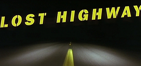


Title designer Jay Johnson: “I think solid design over what is gimmicky or trendy is always favored. Less is more. I like to favor subtle animation moves that add a bit of uniqueness. And if at all possible, even if it is just the design of the font, create a metaphor of the film. Like the ‘Lost Highway’ stencil font emulating roadwork).”
“David Lynch saw my demo reel and was interested in my work. I’m a good listener, so I had a better chance than most of understanding what David was looking for. He is even more eccentric in person than his films. For Lost Highway he was looking for something ‘organic’, as he explained it. One of the original ideas I presented him was these streaking titles that came at the screen and stopped and then collapsed into themselves. It looked like water (water snake from “Abyss”) and was way cool.”
“It was slit scanned on an animation stand which, at the time, and still is, a very cool technique. It was used for the Superman titles. However it really didn’t relate to the highway and was scrapped in favor of the stencil-like font which emulates road work. David Bowie was not part of the project at the time I was designing the sequence.”
Year of production
1997
About Jay Johnson
Jay Johnson studied Art and Graphic Design and is a graduate from the Colorado Institute of Art. He has been designing titles for more than 25 years.
Full credits
Film director
David Lynch
Title designer
Jay Johnson @ Pacific Title and Art
Music
David Bowie