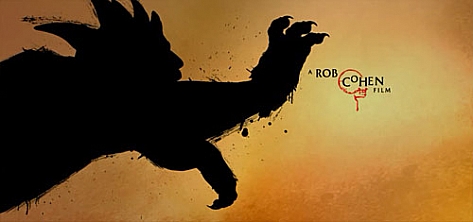


We talked to Karin Fong and Steve Fuller – two of Imaginary Forces‘ leading art directors – about the making of the magnificent end credits for the “The Mummy III”.
RV: Please tell us about the research and design phase of the “Mummy III” credits.
Karin Fong: “The research and design phase is one my favorite parts of the process as we gather all the material relevant to the story. Once we met with Rob [Cohen] and read the script it was apparent that we would be diving into historical China. The Mummy in this film is a risen Emperor who commands a terra-cotta army – right there was a wealth of visuals. At the same time we looked at a lot of Chinese and Asian art, particularly scroll and panel paintings that depicted epic tales. Steve and I liked that we could retell the film as a painted myth. As these were end titles, we could play with the events that the audience just saw.”
Steve Fuller: “We looked at a lot of Chinese brushstroke paintings. Karin and I love the expressive quality a simple brushstroke or splatter can have. We tried to honor that style and spin it into something new that would be appropriate and exciting for a blockbuster movie audience. Graphic novel/comic book-style high-contrast figures and framing was also a big influence. It’s more about beautiful shape when you get into that territory and we wanted to make sure we hit poster-like compositions
Saul Bass and some of the other old masters are always swirling around in my head. I always loved how they boiled things down to simple forms.”
Karin Fong: “Steve and I gravitated towards the ink paintings that had a sense of minimalism. We liked that a grand landscape could be suggested by a few well-placed mountain shapes, or that some pieces of art were simply an ink stroke or a masterfully written piece of calligraphy. We looked at how horses, figures and scenery were stylized. Steve also brought in graphic novels, and looking at those further influenced how we composed frames for more drama. We wanted the piece to feel big and contemporary; this was a big action adventure movie after all!”
Fong: “And of course the film itself was a major source of inspiration—the creatures like the Yeti, the Nian, the landscapes and the big scenery—all of that fed our process. The five Chinese elements play a role in the story, so we used them to structure the sequence into sections, so the environments would change.”
With all these sources of inspiration to draw from, how did you come up with the final style?
Fong: “We really worked out this style in our storyboards, which ended up being very much like the finished piece. Steve and I have always enjoyed spending time figuring things out in this stage – we like bouncing ideas off each other through sketches. At one early point in the process, Steve came over and pointed out a key frame on my desktop—a simple, single thick black ink stroke over red. At that point, we agreed that ideally, each of the scenes would be as stark. We liked that this brush language would be unique to this version of the “Mummy”—this one was taking place in China, not Egypt, so it seemed right to give it a treatment that announced that difference.”
“Steve and I, along with designers Jeremy Cox and Arisu Kashiwagi, created frames that combined brushstrokes, calligraphy and photographs to get the look painterly. Our decisions about the look and feel—transitions, compositions, typography—were figured out at this stage. This served as the roadmap as we moved into producing the piece.”
What technology was used to create these end credits?
Fuller: “The bulk of this was done using 3D software but we really tried to keep the end result very painterly. Whenever it started slipping into that “CG” realm we pulled it back. We also commissioned an expert calligrapher to work with us, and we shot a lot of paint and ink elements that would be impossible to create any other way. Very high-tech and very low-tech.”
What did this expert calligrapher contribute to the project?
Fong: “T.Z. Yuan, a scholar of Chinese calligraphy, is the father of a good friend. On several occasions I’d seen him write beautiful calligraphy at his home. When we were doing the storyboards, we knew we wanted to incorporate written Chinese. We then called upon Dr. Yuan to write the characters for the five elements: fire, water, wood, metal, earth. These became a thread of the piece, “chaptering” each section as we move through the environments. Dr. Yuan also wrote characters for other key ideas in the story, and these appear underneath the end crawl, completing the idea of a Chinese scroll.”
To what extend was the director, Rob Cohen, involved in the creative process?
Fong: “We knew after our initial meeting with Rob that the film was amazingly researched, so we knew a level of authenticity with the art and calligraphy was key. When he shows footage from the film and the intricately designed props and sets, you can see the attention to detail. This extended to our sequence. For instance, we designed red chop stamps as signatures for each of the credits. Upon seeing these, Rob suggested that we put the Chinese translations of the crew designators in these stamps. He wanted to make sure the film was true to the Asian art that inspired it.”
“Rob was really supportive of the epic painting idea from the moment he saw the boards. He was excited by the design and really encouraged us at every turn. That was important in giving us the momentum to move full force into this direction, to re-imagine the story with a very graphic visual style.”
What was the biggest challenge in this project?
Fuller: “Not getting carried away with what you CAN do and keeping it stripped-down. Getting the sequence to flow smoothly through different environments and color spaces and still feel cohesive was challenging. Planning some of the scenes and camera moves were a little tricky. I think everything ended up working really nicely. We made a really long and very tight storyboard for this project and I think that helped us a lot in the execution.”
Fong: “For me, the biggest challenge was being disciplined enough to be true to the idea of a painting. We purposely had to tell ourselves not to over-animate or over-decorate. We’d always have to step back and make sure that we were true to the idea of an ink painting.”
“My favorite part of this project was being able retell the story in a way that complements the film without duplicating what you had just seen. The film has just shown the audience very lush footage with realistic special effects. Steve and I knew that we wanted to contrast that with something more stylized. I liked that we could go in a more abstract direction. I also liked that we could be loose with the themes of the film—here, in this retelling, some things are exaggerated, like they would be in a legend.”
Karin Fong and Steve Fuller both received an Emmy Nomination in 2008 for Outstanding Main Title Design. Steve Fuller for ‘Mad Men’ and Karin Fong for ‘Chuck’.
Interview: Remco Vlaanderen
Year of production
2008
About Steve Fuller and Karin Fong
Steve Fuller was a creative director/live-action director at Imaginary Forces from 2001-2009. During that period he helped start and grow the company’s New York offices. Fuller won an Emmy award in 2008 for his main title sequence for the tv series Mad Men. Recent work includes the main title for Showtime’s tv show Nurse Jackie.
Full credits
Art Directors
Karin Fong and Steve Fuller
Designers
Jeremy Cox and Arisu Kashiwagi
Director (film)
Rob Cohen