


STIRRED, NOT SHAKEN
Karin Fong projects “Bond” for action rom-com
Imaginary Forces’ creative director Karin Fong takes us through the process of creating a sensual title sequence in camera for action rom-com This Means War. Using projections on scantily clad women, IF created a fitting homage to the classic Bond titles, whose swinging style was pioneered by the likes of Maurice Binder and Robert Brownjohn in the early 60s. But this project also reveals that working for the Big Six means that anything can change at any time.
720.jpg "This Means War (stills)")
Spy versus spy over a girl
For title designers, having to convey an often mixed set of concepts in about two minutes on average can prove to be daunting. In the case of This Means War, tapping into an already established iconography solved a lot of the initial design challenges.
Basic premise of the movie: After botching a mission, two CIA spies-slash-best buds get grounded in L.A. where they coincidentally both start dating the same girl – played by Reese Witherspoon. A gentlemen’s fight between the two spy buddies quickly turns epic, as the frenemies turn into violent rivals.
When did you decide to take the 007 homage route?
“McG really wanted something that would set up the two spies at the beginning of the movie as these ‘international men of mystery’,” explains Fong. “So we needed to tap into the fantasy of being a spy. And cultural shorthand for that is that they’d be like these James Bond types.”
If you want to channel 007, you have got to start at the source…
02.jpg "This Means War (still)")
How to project “Bond”
Fong started by looking at every James Bond title possible, paying special attention to those early classics from the 60s and 70s. Familiar territory for a lot of title designers. “First time I ever saw Goldfinder was in college,” recalls Fong. “I remember the projection, and how that’s such a nice, sensual, in-camera way to deal with the type.” In fact, her first title was a Goldfinder-inspired piece, done for an extracurricular student project. “I projected credits on a friend’s torso for his soap opera.”
Goldfinger came out in 1964 and was the third Bond movie. The opening credit sequence was designed by the “hot” American graphic designer and art director Robert Brownjohn, who had recently moved to London. Brownjohn had had great success with his projection-based title sequence for the previous Bond box office hit, From Russia With Love, where he projected the credits on the belly of dancer. For Goldfinger, Brownjohn projected scenes from the film on an almost naked model covered in reflective gold paint. The result is magical and proved to be timeless.
Fong points out that she referenced Maurice Binder‘s iconic main title for Dr. No, too. “Near the end, with the overlapping silhouettes. Just the idea of using girls and equating them with international territory is a very ‘Bond’ idea. It’s a kind of amalgamation, an homage to that.”
Inspiration came from other, less likely places, too. “Pirelli – the tire company – commission a noted art or fashion photographer to shoot top models for it every year. It’s a big inspiration. And 1950s Playboys.”
The design process
Throughout the whole movie the two spies use their CIA spy gear to listen in to each other’s dates. Initially, the plan was that the titles were going to be intercut with footage of the surveillance room, as illustrated in this storyboard.

This Means War – Title concept, Board 2, May 2011.
As any title designer who has worked for one of the major film studios will confirm, those jobs tend to require a tremendous degree of flexibility, as any aspect of a title sequence may change at any time during production. The first change of direction, however, really simplified the design challenge for Fong and her team.
“McG and the film’s editors decided they wanted a standalone concept for the titles,” says Fong. “The titles became a lot less about surveillance, opening up space for new ideas. We just wanted to give a taste of the life these spies led. Alluding to that world, without making it too literal, made it a much more fun and stylistic project.”
“The second, more refined treatment shows a higher level of abstraction and is more about the croppings. It essentially modernizes what the original Bond idea was about.
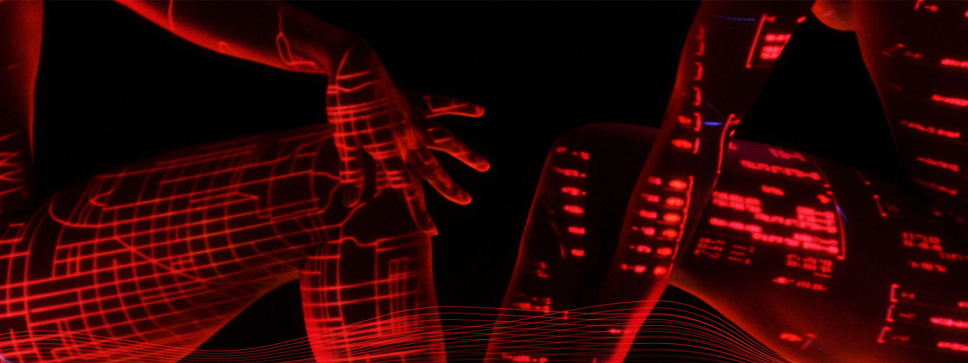
 This Means War – Body Keyframes, Data Treatment, August 2011.
The graphics represent the types of things that would be in the control room, code, diagrams, circuits.

This Means War, Projection Test, World Map, October 2011.
“This is the test we did in house to see what different projections looked like on a body. We wanted to know what worked and didn’t work. We used Max as a guinea pig here.”
Shooting in camera
“Things were a little bit down and dirty,” says Fong, referring not to the barely-dressed talent, but to the bare-bones production of the live action shoot, which took about a day. It all started with auditions in L.A. “We picked four women, dancers and models.”
Fong and her team built a closed set with a small stage that they could light from underneath. “Our DP Aaron Platt was great. He set up these Kinoflow lights on either side to get that very distinct graphic rim lighting that accentuated the shapes of bodies but hid everything else.”
01.jpg "This Means War (still)")
05.jpg "This Means War (still)")
“It’s always fun when you think of a concept you could do in camera. I think some sort of magic happens, some unexpected things that you can’t plan,” says Fong, adding that it would have been “just crazy making” to map all the projections onto moving women in post. Designer Max Strizich and art director Jeremy Cox built a library of data patterns and images to project onto the women, and it was all done in camera. “Jeremy controlled the on-the-fly projections, changing them based on what the dancers were doing.”
Fong emphasizes that the titles are supposed to be a fun tribute to the glamour a Bond Girl represents, while providing an interesting contrast with Reese’s character wielding a blowtorch in the shot that followed.
“We were pushing the abstraction, and making sure that it had the energy that we wanted. And it had to be sensual,” Fong says. “McG was very clear about it, it had to feel sexy.”
War.jpg "This Means War (still)")
This Means War, still.
As the title sequence was going to be in front of the movie, preceded by or intercut with images of surveillance, it made sense to opt for big type, explains Fong, “You have to interrupt everybody’s flow of what’s reality and get into this title sequence, which is super stylized.”
Straight-to-DVD titles?
The title sequence was originally intended to go in front of the movie, but was moved to the end at the very last minute. “Literally, the day as they were wrapping up the movie,” Fong recounts. “I think somebody at Fox said, ‘hmm maybe this doesn’t need a main title’.”
Karin Fong, who’s been working in the industry since the mid 90s when she was hired by Kyle Cooper at RGA/LA, which later became Imaginary Forces, has obviously seen it all before. “That happens with a lot of things, that they ultimately get cut,” she says, putting things in perspective. “It can happen with an ending, or with a character in the film. Everything is always moving around.”
Maybe it’s because she’s got other, more important things on her mind, like expecting her second child (Fong was due a week after our interview), but having to “blur a lot of the girls out” for the final end title? That must have been frustrating.
“We had designed it for the front and it had a very specific place in the story. At the end, it didn’t make sense to show these images of women and we had to lose them, keeping just the soundwaves that originally were there to complement the footage, but of course it’s always a little bit of a bummer,” she says, understating.
Towards the end of the interview Fong laughs it all off, concluding, “I never really believe my titles are in the film until I see them in the theater.”
The titles as originally intented, like you see here, are on the DVD which is out now.
04.jpg "This Means War (still)")
Article: Remco Vlaanderen, © Submarine Channel 17 July 2012. Last update: 18 July 2012. All images used with kind permission.
Year of production
2012
About Karin Fong
Karin Fong is one of the most prolific and versatile title designers of the last three decades, often referred to as the “Saul Bass of her generation”. She’s a chameleon able to adapt to almost any style, often alluding to metaphorical or surrealist interpretations of the film or TV show’s narrative to great effect.
We met with Karin at Imaginary Forces in L.A. to discuss her Main Titles for Tell me a Story, Counterpart, South Park, Jack Ryan and Lost in Space.
Full credits
Designed & Produced by
Imaginary Forces
Director
Karin Fong
Art Director
Jeremy Cox
Designers
Karin Fong, Jeremy Cox, Lindsey Mayer-Beug, Max Strizich
Executive Producer
Gabriel Marquez
Producer
Brian Butcher
Associate Producer
Kacie Barton
Animators
Jeremy Cox, Max Strizich
Editor
Nate Buchik
Flame Artist
Eric Mason
Flame Assistant
Michael Radtke
Coordinator
Annie Chen
Assistent Editor
Zach Kilroy
Design Interns
Nathan Boyd, Eric Dies
LIVE ACTION
Director
Karin Fong
Live Action Producer
Adam Lawson
Director of Photography
Aaron Platt
VFX Supervisor
Jeremy Cox
Talent
Lynda Redwine, Jacqui Defranca, Deanna Sunny Walters, Stefani Stampinato
Studio
20th Century Fox
Feature Director
McG
Production Company
Wonderland Sound and Vision