


The Main-on-End title sequence of 30 Days of Night is a literal and metaphorical exploration of the themes within the movie – a thriller with horror elements about an isolated town in Alaska where the sun sets and doesn’t rise again for thirty consecutive days each year. During one of these periods of total darkness, vampires on a path of destruction ravage the town.
720.jpg "30 Days Of Night (stills)")
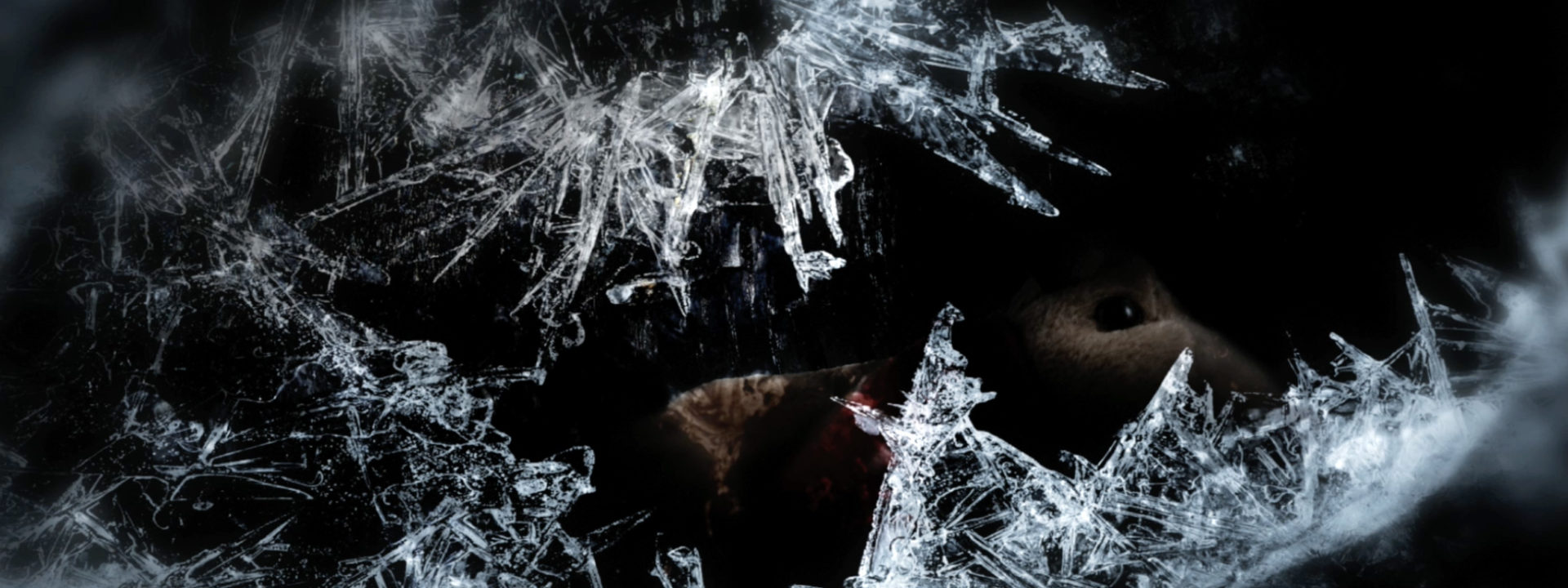
The audience is confronted with a sequence of highly disquieting images that cross-dissolve or fade to black. Details of torn and tainted photographs, northern lights, shadows, a bloody tooth embedded in a thick layer of ice and references to the Alaskan wintercape. Brian Reitzell‘s haunting score greatly enhances the discomforting atmosphere.
Title designer Nic Benns of Momoco: “The burned photos and eerie shattered artifacts slowly reveal the untold horrors the town faced. I wanted to expand the story of the towns people a little – those that survived, others that were the faces behind distant screams in streets, heard throughout the film. I also wanted to hint that one of them -the boy- could be a vampire.”
Nic Benns: “The director David Slade asked us to pitch on this. I usually create a book – love doing boards – to show the director/producer of the film. We explored several directions through storyboards and animated tests before settling on a sequence that worked as a kind of epilogue. The film is the story of an Alaskan town, Barrow, that is plagued by vampires when the sun sets for a month each year.
“In production, I built miniature film sets, like details of the houses out of driftwood, soiled carpet, burned wallpaper, anything I could find in skips or on the streets of Soho in London. We asked for photos of cast and family and Sony supplied some, but we sourced most of the pictures or shot our own to look like the town inhabitants. I then filmed plates of these elements along with organic materials to create the vignettes. The time-lapse ice was real but I found treacle to be quite good blood, along with washing powder mixed with course sea salt for snow. Our meeting room was a mess.”
01.jpg "30 Days Of Night (still)")
“We had two weeks to turn the entire sequence around after storyboards so there was a lot of napping under desks during the day and conference calls at 4 am – with Sony being in L.A. and the post house in New Zealand. Working on the titles through the night really helped produce a more unsettling sequence.
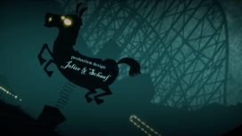
The opening of the film was created by Momoco’s Miki Kato.
Article: Remco Vlaanderen, © Submarine Channel, 4 April 2008. Last update 28 November 2011.
Year of production
2007
About Momoco

Watch the 10″ mini-documentary we made about Momoco featuring Miki Kato and Nic Benns, shot on location at their tiny London studio.
Full credits
Title designer
Nic Benns @Momoco
Film director
David Slade
Music
Brian Reitzell